TypeDance: إنشاء شعارات طباعة دلالية من الصور من خلال التوليد المخصص
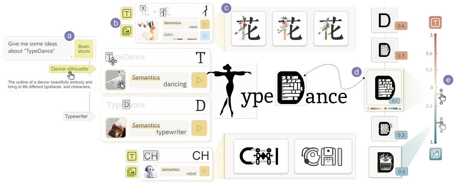
الشكل 1. TypeDance هو أداة تأليف لإنشاء شعارات طباعة دلالية بتصميم مرن وشخصي. من خلال تقطير مبادئ التصميم، فإنه يجسد سير العمل التصميمي ويمكّن المبدعين من (أ) التفكير مع وكيل ذكاء اصطناعي قابل للتفسير، (ب) اختيار نوع الخط بمستويات مختلفة من الدقة والصور من الصور، (ج) التوليد من خلال دمج نوع الخط المختار مع الصور المستهدفة، ثم يمكن للمبدع (د) تقييم و (هـ) تكرار موضع النتيجة الناتجة في طيف الخط والصورة.
تمزج الشعارات الطباعة الدلالية بشكل متناغم بين نوع الخط والصورة لتمثيل المفاهيم الدلالية مع الحفاظ على القابلية للقراءة. تعيق الطرق التقليدية التي تستخدم التركيب المكاني واستبدال الأشكال المتطلبات المتضاربة لتحقيق دمج مكاني سلس بين أنواع الخطوط غير المتشابهة هندسياً والدلالات. بينما جعلت التقدمات الأخيرة من توليد الطباعة الدلالية بواسطة الذكاء الاصطناعي ممكنًا، فإن الأساليب الشاملة تستبعد مشاركة المصممين وتغفل التصميم الشخصي. تقدم هذه الورقة TypeDance، أداة مدعومة بالذكاء الاصطناعي تدمج المبادئ التصميمية مع النموذج التوليدي لتصميم شعارات الطباعة الدلالية الشخصية. تستفيد من المبادئ التصميمية القابلة للجمع المستخرجة من نماذج الصور المرفوعة وتدعم رسم خرائط الخط والصورة بمستويات هيكلية مختلفة، مما يحقق تصاميم جمالية متنوعة مع تحكم مرن. بالإضافة إلى ذلك، نقوم بتجسيد سير عمل تصميم شامل في TypeDance، بما في ذلك التفكير، الاختيار، التوليد، التقييم، والتكرار. أكدت تقييم المستخدمين المكون من مهمتين، بما في ذلك التقليد والإبداع، على قابلية استخدام TypeDance في التصميم عبر سيناريوهات استخدام مختلفة.
مفاهيم CCS:
- منهجيات الحوسبة
الذكاء الاصطناعي.
كلمات وعبارات إضافية: الطباعة الدلالية، النموذج التوليدي، التصميم الشخصي
تنسيق مرجع ACM:
شيشي شياو، ليانغ وي وانغ، شياوجوان ما، ووي زينغ. 2018. TypeDance: إنشاء شعارات طباعة دلالية من الصورة من خلال التوليد الشخصي. في . ACM، نيويورك، نيويورك، الولايات المتحدة الأمريكية، 24 صفحة.https://doi.org/XXXXXXX.XXXXXXX
1 المقدمة
الطباعة الدلالية هي فن دمج نوع الخط والصورة، حيث يتم تصور نوع الخط كتمثيل بصري دلالي مع وضوح عالٍ وقابلية قراءة [21،23،47]. أحد التطبيقات الملحوظة هو الشعار الطباعة الدلالية، الذي يرمز إلى هوية فريدة بطريقة مختصرة ولكن معلوماتية. بسبب تعبيره وقابليته للتذكر [7]، تم استخدام الشعار الطباعة الدلالية على نطاق واسع كتوقيعات بصرية للأفراد [28]، وشعارات تجارية ذات قيمة تجارية [15، 20]، ورموز للأحداث المهمة وترويج المدن [3، 43].
ومع ذلك، فإن إنشاء شعار طباعة دلالية يمثل تحديًا كبيرًا، يتطلب دمجًا سلسًا بين نوع الخط والصورة مع الحفاظ على قابلية القراءة. غالبًا ما يعتمد المصممون ذوو الخبرة على برامج احترافية مثل Adobe Illustrator لضبط مخطط نوع الخط يدويًا لدمج صور معينة، وهو عملية تستغرق وقتًا طويلاً وعرضة للأخطاء. غالبًا ما يجربون أنماطًا مختلفة من الخطوط أو الحروف وأنواعًا مختلفة من الصور للعثور على تمثيل بصري جذاب وقابل للتذكر، مما يزيد من طول العملية. يتطلب ذلك تفكيرًا إبداعيًا، ومهارات عملية، والقدرة على الاستمرار من خلال التجربة والخطأ المستمر. بالإضافة إلى ذلك، تتطلب الهوية الفريدة للشعار مستوى عالٍ من التخصيص والشخصنة في عملية التصميم.
هناك تحديان رئيسيان في الأبحاث ذات الصلة: تقنية الدمج والتأليف الواعي للنوايا. تستفيد أدوات التأليف الحالية من تقنيات دمج متنوعة لإنشاء أنواع أخرى من التصاميم، مثل الرموز الرسومية. كما هو موضح في الشكل 3، تهدف إحدى التقنيات النموذجية إلى دمج المواد الموجودة مكانيًا [13، 64]. تستخدم تقنية أخرى استبدال الأشكال لتحقيق دمج مكاني أكثر، لكنها تعتمد بشكل كبير على تشابه الأشكال بين الكائنات التي يتم دمجها [8، 9]. على الرغم من أن بعض تقنيات التصميم الحسابية تدعم دمج الصور في أنواع الخطوط، إلا أنها مقيدة بالقدرة على تغيير أجزاء معينة من أنواع الخطوط [4، 23، 48]. جعلت التقدمات في نماذج التوليد من النص إلى الصورة [42،63] من الممكن توليد الطباعة الدلالية تلقائيًا، لكنها تطرح تحديًا آخر حول التأليف الواعي للنوايا. نظرًا للعديد من التفاصيل مثل العرض البصري المحدد (مثل الدلالات، اللون، والشكل) في تصميم الشعار، قد لا تكون النصوص التوجيهية قادرة على تمثيل هذه النوايا.
تهدف هذه الدراسة إلى الحصول على رؤى حول مساحة التصميم وسير العمل المعنيين في إنشاء شعارات الطباعة الدلالية، ثم تجسيد هذه المبادئ التصميمية لإنشاء أداة مدعومة بالذكاء الاصطناعي تسهل التوليد الشخصي. من خلال تحليل مجموعة مختارة، تم تحديد مساحة تصميم منهجية، تركز على دقة نوع الخط (أي، مستوى السكتة الدماغية، الحرف، ومستوى الحروف المتعددة) ورسم خرائط الخط والصورة (أي، رسم خرائط واحد إلى واحد، واحد إلى العديد، والعديد إلى واحد). بالإضافة إلى ذلك، تم إجراء مقابلات مع ثلاثة خبراء لجمع رؤى حول التحديات والاهتمامات المتعلقة بالتعاون مع الذكاء الاصطناعي في عملية التصميم. أبرزت النتائج الفرصة لتبسيط عملية الدمج المرهقة وتحديد مادة واضحة وصريحة للتواصل الفعال لنوايا التصميم إلى النماذج التوليدية.
نقترح TypeDance، أداة تأليف تمكّن كل من المبتدئين والمصممين من تقنية دمج قوية لإنشاء شعارات طباعة دلالية من الصور المخصصة من قبل المستخدم. مستلهمين من “صورة واحدة تساوي ألف كلمة” [17،44] و”كل ما تراه يمكن أن يكون مادة تصميم” [14،62]، نسمح للمبدعين بالتعبير عن
نوايا التصميم الخاصة بهم من خلال تسليط الضوء على التمثيل البصري في صورهم الخاصة. في الوقت نفسه، يتم استخراج مصادر إلهام تصميم متعددة من مراجع الصور لتخصيص التصميم. بالإضافة إلى ذلك، نقدم تقنية دمج جديدة تعتمد على نماذج الانتشار التي تدعم دمج الصور مع نوع الخط على جميع مستويات الدقة. لضمان قابلية قراءة كل من نوع الخط والصورة، نستفيد من نموذج رؤية-لغة لمساعدة المبدعين في تحديد موضع الناتج الناتج ضمن طيف الخط والصورة. كما نُمكّنهم من تعديل وتحسين الناتج، مثل جعله يشبه نوع الخط ”
(1) دراسة تشكيلية تحدد أنماط التصميم القابلة للتعميم وسير العمل القابل للمحاكاة.
(2) إدخال واعٍ للنوايا يعتمد على صورة مخصصة من قبل المستخدم تتجاوز النصوص التوجيهية الغامضة، مما يوفر وصفًا بصريًا مفصلًا لتصميم الشعار المطلوب للذكاء الاصطناعي التوليدي.
(3) تقنية دمج تدمج بسلاسة الصور مع جميع مستويات دقة نوع الخط.
(4) أداة تأليف تدمج سير عمل شامل، مما يمكّن المبدعين من التفكير، الاختيار، التوليد، التقييم، والتكرار في تصاميمهم.
2 الأعمال ذات الصلة
2.1 تصميم شعار الطباعة الدلالية
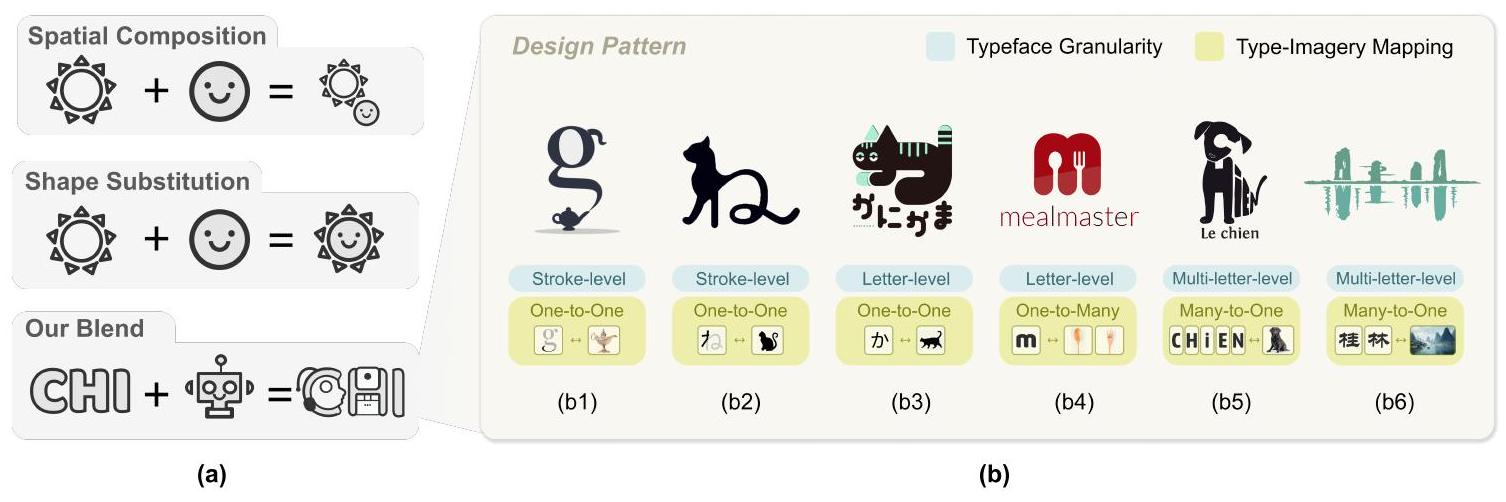
شعارات الطباعة الدلالية هي تكامل متناغم بين نوع الخط والصورة، حيث يتم توضيح الصورة بصريًا بواسطة نوع الخط [23، 43، 48]. بالمقارنة مع العلامة النصية البسيطة [50، 52] والشعار التصويري [22، 30]، يسمح الشعار الطباعة الدلالية بنهج أكثر تماسكًا لترميز كل من المحتوى النصي والرسومي وتعزيز الارتباط بينهما. لقد أدت القدرة على تجسيد الرمزية الغنية والتعبيرية إلى زيادة اعتماد شعارات الطباعة الدلالية عبر سيناريوهات مختلفة، مثل الترويج الثقافي [3]، والعلامات التجارية التجارية [15]، والهوية الشخصية [28]. لقد استكشفت الأبحاث الواسعة كيف يمكن تصميم أنواع الخطوط لتعزيز المعنى الدلالي على مستويات مختلفة من الدقة. تقسم بعض الدراسات نوع الخط إلى سلسلة من الضربات الهيكلية مع تقسيم موجه من قبل المستخدم [38] وتقسيم تلقائي [4]، ثم تطبق التزيين الهيكلي على كل ضربة ونقطة تقاطع بشكل منفصل. في المقابل، حولت الدراسات الحديثة [23، 48، 59] تركيزها من تزيين مستوى الضربة إلى تزيين الحروف الفردية باستخدام قوالب محددة مسبقًا. على سبيل المثال، استبدل تندولكار وآخرون [48] الحروف بأيقونات كليب آرت ذات صلة بالصورة وتشبه بصريًا الحرف المقابل. نهج آخر، كما أظهر شيو وآخرون [55]، يتضمن ضغط الحروف المتعددة وترتيبها في شكل دلالي محدد مسبقًا. لقد تم تعزيز هذا النهج بشكل أكبر من قبل زو وآخرون [66]، الذين اقترحوا إطار عمل تلقائي يدعم وضع وتعبئة وتشويه الكاليغرامات المضغوطة.
بينما بحثت الأبحاث السابقة بشكل موسع في الشعار الطباعة الدلالية عبر درجات تصميم نوع الخط المختلفة، لا تزال هناك مشكلتان رئيسيتان: 1) تم بناء هذه النماذج لأنواع الخطوط بدقة محددة، مما يحد من قابليتها للتطبيق، و2) القليل معروف عن العلاقة بين نوع الخط والصورة. عادةً ما تستخدم هذه الأعمال نهجًا بسيطًا حيث يتم إقران نوع خط واحد بصورة محددة واحدة. لاستكشاف مساحة التصميم، نجمع مجموعة بيانات من العالم الحقيقي، ونحلل دقة نوع الخط وعلاقة نوع الخط بالصورة، ونطبق هذه المبادئ التصميمية في TypeDance. ثم نقترح إطار عمل موحد يعتمد على نموذج الانتشار لدعم المزج المرن بين الصور وأنواع الخطوط بمستويات دقة مختلفة.
2.2 نموذج توليدي للتصميم الحسابي
لقد حظي التصميم الحسابي باهتمام كبير في مجال التقنيات التوليدية. مؤخرًا، كانت هناك تقدمات في محاذاة المعنى الدلالي بين أزواج الصور والنصوص، مما يجعل اللغة الطبيعية أداة قيمة تسد الفجوة بين البشر والإبداع [29، 39]. استغلت العديد من الدراسات مثل هذه الاتساق الدلالي لاسترجاع الصور ذات الصلة من مجموعة البيانات باستخدام بيانات اللغة الطبيعية، والتي يمكن استخدامها كمواد تصميم لتوليد تصاميم جديدة [12، 64]. بينما اعتمدت الدراسات السابقة على الاسترجاع من مجموعة بيانات محدودة وقوالب محددة مسبقًا، اقترحت الأبحاث الحديثة نماذج انتشار النص إلى الصورة [40، 47] التي تتجاوز نماذج GAN السائدة [18] ونماذج الانحدار الذاتي [41]. ومع ذلك، يعتمد هذا التوليد الموجه بالنص بشكل كبير على المطالبات المصممة جيدًا، مما يؤدي إلى نتائج غير مستقرة تفتقر إلى التحكم من قبل المستخدم. لمعالجة هذه المشكلة وتعزيز تخصيص المستخدم، قدمت التقدمات الحديثة شروطًا قائمة على الصور لتحقيق التلاعبات القابلة للتحكم، بما في ذلك خريطة العمق [42] وخريطة الحواف [63]. تدعم بعض النماذج التوليدية التي تركز على تزيين الخطوط فقط توليد مستوى الحروف [23] وتتطلب جمع الصور التي تحتوي على الصورة المحددة لضبط النموذج [47].
بينما أظهرت الأعمال السابقة قدرة توليدية مذهلة في إنشاء هياكل معقدة ودلالات ذات معنى، لا يزال ضمان قابلية قراءة كل من نوع الخط والصورة يمثل تحديًا صعبًا. على وجه الخصوص، تفتقر شروط النص إلى قيود كافية لالتقاط جميع نوايا المستخدم، بينما تكون شروط الصورة صارمة للغاية ولا يمكن أن تستوعب إدراج معلومات إضافية. لمواجهة هذا التحدي، اقترح مو وآخرون [34] نهجًا يجمع بين شروط متعددة لتحسين القابلية للتحكم. بالمثل، يقوم Vistylist [45] بفك تشابك مساحة التصميم، مما يمكّن من التوليد مع عوامل التصميم المقصودة من قبل المستخدم. يبني TypeDance على هذه الجهود البحثية السابقة من خلال توفير عدة مبادئ تصميم تشير إلى خصائص شعارات الطباعة الدلالية. تعمل هذه المبادئ التصميمية المستخرجة من الصور المقدمة من المستخدم كإرشادات للمستخدمين لاختيارها ودمجها في تصاميمهم. مع دعم لكل من شروط النص والصورة، يمكّن TypeDance المستخدمين من التحكم المرن، مما يتيح نتائج تصميم شخصية ومميزة.
2.3 أداة تأليف التصميم الجرافيكي
لقد طورت أعمال كبيرة أدوات تأليف لتسهيل التصميم الجرافيكي، والتي يمكن تقسيمها بشكل عام إلى فئتين رئيسيتين: أدوات الإبداع وأدوات الإنشاء. في مجال الإبداع، اقترحت عدة دراسات بحثية [24، 26، 56] واجهات تهدف إلى إلهام الأفكار وتسهيل استكشاف مواد التصميم. على سبيل المثال، استخدم MetaMap [24] هيكلًا يشبه خريطة ذهنية تشمل ثلاثة أبعاد تصميم لتحفيز المستخدمين وتشجيعهم على توليد مجموعة واسعة من الأفكار الفريدة والمتنوعة. فيما يتعلق بعملية الإنشاء، كما حدد شياو وآخرون [54]، تتبع الأعمال السائدة خط أنابيب من مرحلتين، يتضمن استرجاع أمثلة وتكييفها كمواد تصميم [62] ومرجع نقل الأسلوب [45]. مؤخرًا، سعى الباحثون إلى دمج الأساليب لإنشاء تصميم جديد بناءً على مواد التصميم الموجودة. خلال العملية، يتم اعتماد تجميع أيقونات ذات صلة دلاليًا بشكل مكاني لتوليد تصميم مركب بطريقة مبتكرة من قبل بعض الباحثين [13، 64]. بالمثل، أظهر زانغ وآخرون [61] أن تجميع عناصر الصورة المتماسكة يمكن أن ينشئ نوع خط زينة بتغطية مفاهيم واسعة. من ناحية أخرى، استكشفت تشيلتون وآخرون [8، 9] المزيد من إمكانيات الدمج من خلال استبدال الأشكال المماثلة. على سبيل المثال، أظهروا أن “شعار ستاربكس” يمكن أن يحل محل موضع “الشمس” حيث أن كلاهما له شكل دائري.
ومع ذلك، تواجه تقنيات التركيب المكاني واستبدال الأشكال تحديات عند التعامل مع تعقيد شعارات الطباعة الدلالية، حيث يحتاج نوع الخط والصورة إلى الاندماج مكانيًا ككل على الرغم من غياب تشابه الشكل. في هذا العمل، يستخدم Typedance نماذج الانتشار لدمج تفاصيل الصورة بينما
يحافظ على التمثيل البارز لنوع الخط، مما يمكّن من مزج أكثر طبيعية. بالإضافة إلى ذلك، يدمج Typedance كل من وظائف الإبداع والإنشاء. لضمان قابلية قراءة كل من نوع الخط والصورة في شعارات الطباعة الدلالية، تم دمج عنصر تقييم إضافي، مما يعزز مصداقية عملية التصميم.
يحافظ على التمثيل البارز لنوع الخط، مما يمكّن من مزج أكثر طبيعية. بالإضافة إلى ذلك، يدمج Typedance كل من وظائف الإبداع والإنشاء. لضمان قابلية قراءة كل من نوع الخط والصورة في شعارات الطباعة الدلالية، تم دمج عنصر تقييم إضافي، مما يعزز مصداقية عملية التصميم.
3 دراسة تشكيلية
لتطبيق مبادئ التصميم الحقيقية في TypeDance، استخرجنا سير عمل تصميم قابل للمحاكاة من مقابلات شبه منظمة وأنماط تصميم قابلة للتعميم من تحليل مجموعة البيانات.
المشاركون. أجرينا مقابلات شبه منظمة مع ثلاثة خبراء: أستاذ تصميم يقود فرق تصميم الشعارات للمؤتمرات الدولية وهويات المدن (E1)، مصمم علامة تجارية لديه أكثر من 11 عامًا من الخبرة في تصميم شعارات الشركات والشركات الناشئة (E2)، ومصمم شعارات حصل على عدة جوائز تصميم مشهورة (E3). جميع الخبراء الثلاثة لديهم خبرة واسعة في تصميم الطباعة الدلالية.
الإجراء. بدأت كل مقابلة فردية، التي استمرت من ساعة إلى ساعة ونصف، بعرض عمل الشخص المقابل من وسائل التواصل الاجتماعي. ثم تعمقنا في تفسيرهم وشرحهم التفصيلي لعملية التصميم. أخيرًا، طرحنا أسئلة حول الخطوات الرئيسية في إنشاء شعار طباعة دلالية، وأصعب خطوة، والتوقعات والاهتمامات بشأن النماذج التوليدية.
3.1 سير العمل العامة والتحديات
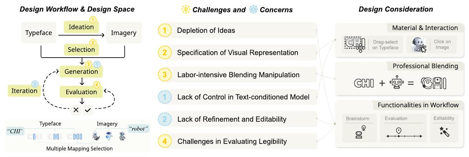
3.1.1 سير العمل العام في التصميم. تصميم الطباعة الدلالية هو عملية إبداعية تتضمن توليد أفكار مبتكرة وتنفيذها. كما هو موضح في الشكل 2، يتكون سير العمل العام عادةً من خمس خطوات.
- توليد الأفكار. في البداية، غالبًا ما يُعطى المصممون نصًا ثابتًا، مثل اسم العلامة التجارية. استنادًا إلى سيناريوهات الاستخدام، يحتاجون إلى ابتكار أفكار جديدة تتعلق بالصور المحتملة.
- الاختيار. بمجرد أن يؤكد المصممون فكرة التصميم، يقومون بإعداد مواد التصميم مع جانبين حاسمين: 1) جزء من هيكل الخط و 2) التمثيل البصري المحدد للصور. تتطور اختيار الخط من خلال محاولات متعددة مع درجات مختلفة، مثل ضربة واحدة أو الخط بالكامل. ذكر جميع الخبراء أنهم حصلوا على الإلهام للتمثيل البصري من الصور، سواء التي قدمها العملاء، أو التي تم جمعها من مجتمعات مشاركة التصميم، أو من معرض حياتهم الخاص. تعتبر الصور أيضًا مصدرًا لإلهام آخر. كما أشار E1، “عادةً ما أكتشف إلهامًا جديدًا في الصور، مثل لوحة الألوان.”
- الجيل. يبدأ المصممون بتبسيط التمثيل البصري إلى شكل أساسي يتوافق مع هيكل الخط في الرسم. ثم يقومون بتعديل مخطط الخط باستخدام برامج احترافية مثل أدوبي إليستريتور، مما يدمجها بسلاسة مع الصور المختارة.
- التقييم. عند الانتهاء من التصميم، سيقوم المصممون بتقييم وضوح كل من الخط والصور المدمجة في عملهم. وغالبًا ما يعتمد ذلك على التحقق الخارجي من أفراد آخرين غير المصممين أنفسهم.
- التكرار. يتم إجراء التكرار طوال عملية التصميم. يقوم المصممون بإجراء تجارب متعددة وتحسينات في كل خطوة للوصول إلى النتائج المحتملة. يستمر التحسين حتى يتم تحقيق تصميم نهائي.
3.1.2 التحديات في سير العمل.
(1) استنفاد الأفكار خلال جلسات العصف الذهني. يعتبر الخبراء على نطاق واسع أن ولادة الإلهام الجيد هي مزيج من الخيال والصدفة. يؤكد E2 على أهمية التعمق في القصة وراء العلامة التجارية ثم دمجها في تصميم الشعار. يتضمن ذلك جمع المعرفة الخلفية واكتشاف الصور التي تتناغم مع الإدراك البشري. تعتبر الخطط المتنوعة للبدائل ضرورية للتكرار.
الشكل 2. تم توضيح سير العمل العام لتصميم الشعار الطبوغرافي الدلالي من خلال مقابلة الخبراء، مع تحديد التحديات الرئيسية في سير العمل واهتمامات الذكاء الاصطناعي التوليدي في المراحل المقابلة. استنادًا إلى سير العمل والتحديات والاهتمامات، تم تعزيز اعتبارات التصميم لـ Typedance.
(2) توضيح التمثيل البصري المحدد للصور. يستكشف المصممون غالبًا أجزاء متنوعة من نوع الخط أثناء تجربتهم مع خيارات الصور المختلفة لتحقيق النتائج الأكثر مثالية وجاذبية بصريًا. ومع ذلك، يمكن تصوير صورة واحدة بطرق بصرية متنوعة، كما هو موضح من خلال الروبوتات المتنوعة في الشكل 2، مما يشكل تحديًا في تحديد واحدة معينة. بالإضافة إلى ذلك، يمكن أن تعقد توافق الصورة مع نوع الخط عملية الاختيار.
3) التلاعب الممل والمرهق في دمج نوع الخط والصور. يتطلب تصميم شعار من مسودة تصور وتنفيذ احترافي لدمج صور وأنواع خط مختلفة بشكل كبير. كما ذكرت E3، “أحيانًا يكون من الصعب عندما يصر عميلتي على وجود كل من الحرف ‘M’ وقط يقف من الصورة التي أعطتني إياها – من الصعب العثور على أوجه التشابه في أشكالها.” بالنسبة للتنفيذ، على الرغم من الاعتماد على برامج احترافية مثل CorelDRAW وAdobe Illustrator، تظل عملية الدمج يدوية، مما يستهلك قدرًا كبيرًا من الوقت والجهد.
4) التحديات في تقييم القابلية للقراءة. يجب أن لا يسبب الشعار الطباعي الدلالي الناجح ارتباكًا للجمهور بشأن نوع الخط أو معناه. ومع ذلك، غالبًا ما يعتمد تقييم القابلية للقراءة على الحكم الذاتي للمصممين بدلاً من أن يكون مستندًا إلى إدراك الجمهور العام. وهذا يشكل تحديًا في تحقيق تقييم عادل.
3.2 المخاوف المتعلقة بمشاركة النموذج التوليدي
مع ظهور النماذج التوليدية مثل ميدجورني، بدأ العديد من المصممين في تبني الذكاء الاصطناعي كمساعد في التصميم. فيما يلي اثنان من المخاوف الرئيسية بشأن تدخل الذكاء الاصطناعي في عملية تصميمهم.
(1) نقص القدرة على التحكم في النموذج التوليدي المعتمد على النص. الطريقة الأكثر استخدامًا للتحكم في النماذج التوليدية هي من خلال العبارات النصية. على الرغم من أن هناك أدوات متنوعة يمكن أن تساعد في تصميم العبارات، مثل PromptBase
(1) نقص القدرة على التحكم في النموذج التوليدي المعتمد على النص. الطريقة الأكثر استخدامًا للتحكم في النماذج التوليدية هي من خلال العبارات النصية. على الرغم من أن هناك أدوات متنوعة يمكن أن تساعد في تصميم العبارات، مثل PromptBase
الشكل 3. (أ) مقارنة تقنية المزج بين الأعمال السابقة وTypeDance. (ب) بعض أمثلة الشعارات الطبوغرافية الدلالية من المجموعة، كل منها مُعَلَّم بنمط التصميم المقابل، بما في ذلك دقة نوع الخط ورسم الصور بالنوع.
- نقص في التهذيب وقابلية التعديل للنتائج الناتجة. يبدو أن نقص قابلية التعديل في النتائج هو مشكلة شائعة في النماذج المولدة. بينما قد يكون المستخدمون راضين بشكل عام عن النتيجة الكلية، قد تكون هناك حالات لا تلبي فيها بعض التفاصيل توقعاتهم (مثل، عدم إعجابهم بالألوان، أو وجود أشياء زائدة). إحدى الطرق لمعالجة ذلك هي إعادة توليد الصورة بالكامل، مما يؤدي إلى فقدان التصميم الحالي.
3.3 مساحة التصميم للطباعة الدلالية
لتحديد أنماط التصميم التي تشكل الشعارات الطبوغرافية الدلالية بشكل أكبر، نقوم بجمع وتحليل مجموعة من 427 مثالًا من العالم الحقيقي.
3.3.1 دقة نوع الخط. بينما تمتلك اللغات المختلفة رموزها الفريدة، إلا أنها تتوافق مع دقة هيكلية مشتركة. تتضمن هذه التسلسل الهرمي، المرتب من المحلي إلى العالمي، الخط، الحرف، ومتعدد الحروف، على التوالي.
3.3.1 دقة نوع الخط. بينما تمتلك اللغات المختلفة رموزها الفريدة، إلا أنها تتوافق مع دقة هيكلية مشتركة. تتضمن هذه التسلسل الهرمي، المرتب من المحلي إلى العالمي، الخط، الحرف، ومتعدد الحروف، على التوالي.
- مستوى الضربة. غالبًا ما يستخدم تحليل الضربات، حيث يتم ربط ضربة واحدة أو مجموعة من الضربات بالصور (123/427 مثال). كما هو موضح في الشكل 3 (b1)، يتماشى فوهة إبريق الشاي مع المنحنى الأصلي في الحرف “
“، مما يعزز التعبير الدلالي مع الحفاظ على سلامة نوع الخط. كأصغر وحدة في نوع الخط، يمكن تنفيذ مزج مستوى السكتة عدة مرات داخل نوع الخط لإثراء التمثيل البصري. - مستوى الحرف. تُستخدم الحروف الفردية بشكل شائع في مجموعتنا المجمعة (189/427 مثال). بدلاً من إجراء دمج على مستوى الحرف لكل حرف على حدة، تميل بعض الأمثلة إلى التركيز على حروف تمثيلية جزئيًا داخل الكلمة، لا سيما الحرف الأول في الشكل 3 (b6). لتأكيد الصورة، يستخدمون تقنيات مثل التغيير في الحجم، والإطالة، والدوران على الحروف.
- مستوى متعدد الحروف. دمج الصور مع حروف متعددة أو كلمات كاملة هو دمج مستوى متعدد الحروف (115/427 مثال). يعتبر الخط وحدة متماسكة وينظم الحروف مكانيًا في موضع مناسب. وفقًا للشكل 3 (b5)، يتم إعادة ترتيب الحروف وتشويهها لإنشاء الشكل الظاهر المعروف لكلب.
3.3.2 رسم الخرائط بين النوع والصورة. نلاحظ ارتباطًا معقدًا بين نوع الخط والصورة. تبسط الأعمال السابقة هذا الارتباط من خلال اعتماد استراتيجية رسم خرائط واحدة، حيث يتم ربط حرف واحد بصورة معينة. لتقريب TypeDance من ممارسة التصميم لشعار الطباعة الدلالية، نقوم بتشفير المجموعة يدويًا وتحديد ثلاثة أنماط رسم خرائط نموذجية: واحد إلى واحد، واحد إلى متعدد، متعدد إلى واحد. مع فهم شامل لكيفية تفاعل نوع الخط مع الصورة، يمكننا تجسيد مبادئ التصميم بشكل أفضل لتعزيز عملية الإبداع. - تطابق واحد إلى واحد. يتوافق شعار واحد مع صورة واحدة تُلاحظ عادةً في المجموعة.
أمثلة). إنها تحافظ على هياكل الخط باستخدام ضربات أو حروف جزئية لتمثيل نفس الصورة. على سبيل المثال، في الشكل 3 (ب1)، تتضمن الحرف “g” صورة لصنبور إبريق الشاي. بالإضافة إلى ذلك، لاحظنا أن الشعارات التي تحتوي على تطابق واحد لواحد غالبًا ما تستخدم صورًا متكررة بأسلوب متسق ضمن نوع خط معين. - توزيع واحد إلى متعدد. الشعار الطبوغرافي الدلالي في هذا الجزء سيقوم بتوزيع صور متعددة في نوع الخط المستخدم في التصميم (14/427 مثال). يدعم هذا النوع من التوزيع تغطية غنية للصور ضمن مساحة مضغوطة، حيث تشترك المفاهيم الدلالية عادة في نفس الموضوع. الشكل 3 (b4) يدمج كل من الملعقة والشوكة في حرف
، مما يبرز موضوع الوجبة. - الخرائط المتعددة إلى واحدة. يتضمن جانب آخر دمج عدة حروف في نوع خط واحد في صورة واحدة (119/427 مثال)، وعادة ما يتم تحقيق ذلك من خلال دمج كلمات كاملة لنقل تمثيل بصري معقد للمعنى، انظر الشكل 3 (b3، b4). يمكن تتبع هذا النهج الإبداعي إلى جوزيبي أركيمبولدو، الذي دمج ببراعة عناصر وأشكال مختلفة لإنشاء بورتريهات وأشكال متماسكة [32]. تعزز الخرائط المتعددة إلى واحدة الوحدة العامة وتعمق التعبير عن المعنى الدلالي.
3.3.3 الملخص. من خلال تحليل النصوص، نكشف عن تباين في نوع الخطوط وأنماط مختلفة من تصوير الحروف. يجمع مزيج هذه الأنماط التصميمية فرصة لنقل تمثيلات بصرية غنية. تلتزم كل من الرموز الكتابية واللغات الأبجدية بهذه الأنماط ولكنها تظهر تفضيلات مميزة. الهيكل المعقد للخطوط في الرموز الكتابية وأصولها التصويرية المتأصلة يؤديان إلى تركيبات تصويرية أكثر تعقيدًا. على سبيل المثال، مقارنةً بالكلمة الفرنسية في الشكل 3 (b5)، تحقق الكلمات الصينية في الشكل 3 (b6) تمازجًا مع اللوحات التقليدية للمناظر الطبيعية دون إعادة ترتيب الخطوط مكانيًا.
بالإضافة إلى ذلك، نلاحظ الفروق في تصميم الشعارات في العالم الحقيقي مقارنة بالتعريف الرسمي للطباعة الدلالية. في تصميم الشعارات في العالم الحقيقي، لا يتم تطبيق المزج بشكل موحد على جميع الخطوط. بدلاً من ذلك، يتم التركيز على الحروف في الموضع الأول أو تلك المرتبطة دلالياً بالصورة.
4 اعتبارات التصميم
تكشف المقابلة مع الخبراء أن تخصيص شعار طباعة دلالي يعتمد على دمج أنواع خط معينة (مثل، بمستويات دقة مختلفة) وصور (مثل، تمثيل بصري ملموس)، والتي تم تحديدها بشكل أكبر من خلال تحليل النصوص. تبرز التحديات في سير عمل المستخدم والقلق بشأن الذكاء الاصطناعي التوليدي أهمية استخدام الصور المتاحة بسهولة لتحقيق تخصيص فعال، مما يلغي الحاجة إلى مطالبات نصية معقدة قد لا تعكس نوايا المستخدم بالكامل. موجهة
وفقًا لمبدأ تصميم شنييدرمان [46] المتمثل في “التصميم مع عتبات منخفضة، وأسقف عالية، وجدران واسعة”، هدفنا هو تطوير أداة تمكّن المبتدئين من الإبداع باستخدام مواد وتفاعلات سهلة الوصول (D1)، وتقوم بأتمتة معالجة الخلطات المعقدة للمحترفين (D2)، وتدمج الوظائف الأساسية لعملية تصميم سلسة (D3). يتم توضيح خارطة الطريق التي نستمد منها اعتبارات التصميم في الشكل 2. أدناه، نقدم مجموعة من اعتبارات التصميم:
وفقًا لمبدأ تصميم شنييدرمان [46] المتمثل في “التصميم مع عتبات منخفضة، وأسقف عالية، وجدران واسعة”، هدفنا هو تطوير أداة تمكّن المبتدئين من الإبداع باستخدام مواد وتفاعلات سهلة الوصول (D1)، وتقوم بأتمتة معالجة الخلطات المعقدة للمحترفين (D2)، وتدمج الوظائف الأساسية لعملية تصميم سلسة (D3). يتم توضيح خارطة الطريق التي نستمد منها اعتبارات التصميم في الشكل 2. أدناه، نقدم مجموعة من اعتبارات التصميم:
D1. تصميم المواد والتفاعل المدرك للنوايا. نهدف إلى دعم اختيار المواد المرنة، مما يسمح بالتبديل السهل بين أنواع الخطوط بمستويات دقة مختلفة واختيار الصور من تمثيلات بصرية محددة في صورة مخصصة من قبل المستخدم.
D2. تسهيل عملية توليد المحترفين. نهدف إلى اقتراح نهج خلط تلقائي يدعم الخطوط على جميع مستويات الدقة، مما يضمن تصاميم متناغمة ومتنوعة.
D3. توفير الوظائف اللازمة لدعم سير العمل الشامل. في مرحلة ما قبل التوليد، سنقوم بإدراج وحدة لتوليد الأفكار للعصف الذهني. في مرحلة ما بعد التوليد، ستتم إضافة وحدة التقييم والتكرار لتحديد وتحرير وتنقيح النتيجة المولدة ضمن طيف الصور النوعية.
5 تايب دانس
استنادًا إلى المبررات التصميمية المحددة والفرصة المميزة لمعالجة التحديات والاهتمامات في سير العمل التصميمي، قمنا بتطوير TypeDance، وهو نظام تأليف يسهل التوليد الشخصي لشعارات الطباعة الدلالية. يتكون TypeDance من خمسة مكونات أساسية، تتوافق بشكل وثيق مع مراحل ما قبل التوليد، والتوليد، وما بعد التوليد. في مرحلة ما قبل التوليد، يتواصل مكون الإبداع مع المستخدم لجمع الصور المفهومة (D1). يتيح مكون الاختيار للمستخدم اختيار مواد تصميم محددة، بما في ذلك نوع الخط بمستويات مختلفة من التفاصيل والصور ذات التمثيلات البصرية المحددة (D2). يمزج مكون التوليد هذه المواد التصميمية، مستخدمًا سلسلة من المبادئ التصميمية القابلة للتجميع (D3). بعد التوليد، يمكّن مكون التقييم المستخدم من تقييم موقع النتيجة الحالية في طيف النوع-الصورة (D4). يمكّن مكون التكرار المستخدم من تحسين تصميمه من خلال ضبط طيف النوع-الصورة وتحرير كل عنصر فردي (D5).
5.1 توليد الأفكار
بفضل القدرات المذهلة لفهم اللغة والتفكير التي تتمتع بها نماذج اللغة الكبيرة، يمكننا الآن التعاون مع عقل مطلع من خلال النصوص. تستفيد TypeDance من Instruct GPT-3 (davinci-002) [36] مع تحفيز سلسلة الأفكار [53] لتوليد صور ذات صلة بناءً على النصوص المقدمة. لتعزيز فهم المستخدم، تتضمن استراتيجية التحفيز شرطًا لمرافقة الصور بشرح يتعلق بالتصميم البصري. وهذا يضمن أن تكون الإجابات المقدمة أكثر قابلية للتفسير ومعلوماتية. على سبيل المثال، عندما يقدم المستخدم الكلمة الرئيسية “هاواي”، تولد TypeDance صورًا ملموسة مثل “قميص ألوها”، “راقص الهولا”، و”شجرة النخيل”. بالإضافة إلى هذه الكلمات التصويرية، تقدم TypeDance أيضًا شروحات مثل “ترمز إلى الثقافة النابضة بالحياة وشكل الرقص التقليدي في هاواي” لراقص الهولا. من خلال إجراء هذا التغيير البسيط، تقدم TypeDance شروحات قابلة للتفسير وتوفر للمستخدمين معرفة إضافية لتعزيز فهمهم.
5.2 الاختيار
تهدف الاختيارات إلى إعداد مواد التصميم المدمجة في الجيل التالي. وهي تشمل عنصرين أساسيين: اختيار نوع الخط
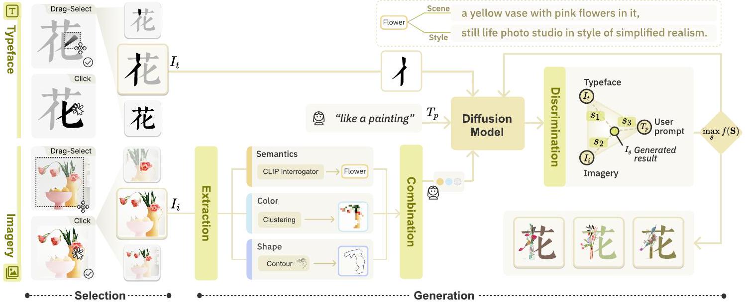
الشكل 4. مكون الاختيار والتوليد في سير عمل TypeDance. يقدم مكون الاختيار نوعين من التفاعل لتمكين المبدعين من اختيار الخط بشكل مرن.
المحفزات البصرية كمدخل، بما في ذلك الصندوق والنقطة. كما هو موضح في الشكل 4، فإن الخصائص المختلفة المتأصلة في الخطوط والصور تؤدي إلى تفاعلات متنوعة تهدف إلى التوافق مع المبادئ التصميمية.
اختيار الخط. بالنظر إلى النص، يسمح TypeDance للمبدعين باختيار الخطوط
اختيار الصور. فيما يتعلق باختيار الصور، نستخدم التقسيم الدلالي لاستخراج التمثيل البصري الذي يحتاجه المبدعون من خلفية مزدحمة. ومع ذلك، على عكس اختيار الخط، فإن طبيعة اختيار الصور أكثر ملاءمة للنقر بدلاً من السحب والاختيار. كما هو موضح في الشكل 4، يمكن أن يشمل السحب والاختيار عن غير قصد أشياء أخرى قد لا يحتاجها المبدع أثناء اختيار الشيء المرغوب. لمعالجة هذه المشكلة، قمنا بتنفيذ حل حيث يمكن للمبدعين النقر على الأشياء الفردية بشكل منفصل، مما يقلل من مشكلة تغطية الأشياء غير المقصودة. بالمثل، يدعم TypeDance أيضًا الاختيار المركب، مما يسمح للمبدعين باختيار عدة أشياء داخل الصورة.
5.3 التوليد
5.3.1 توليد المدخلات. يصف هذا القسم المدخلات الثلاث المطلوبة لعملية التوليد. المدخل الأول هو الخط المختار
الدلالات. المحفز النصي هو وسيلة سهلة وبديهية للمبدعين لتوجيه الذكاء الاصطناعي، والذي يقدم أيضًا وسيلة لدمج الصور في عملية التوليد. ومع ذلك، من الصعب وصف كمية كبيرة من المعلومات ضمن قيود طول المحفز المحدود. يحل TypeDance هذه المشكلة من خلال استخراج وصف الصورة المختارة تلقائيًا. يتضمن وصف الصورة المختارة عملية عكس نص تشمل أبعاد دلالية ملموسة متعددة. واحدة من الدلالات البارزة هي الفهم البصري العام لمشهد. على سبيل المثال، في الشكل 4، يكون وصف المشهد هو “مزهرية صفراء مع زهور وردية.” نحن نلتقط هذه المعلومات البصرية الصريحة (الشيء، التخطيط، إلخ) باستخدام BLIP [29]، وهو نموذج رؤية-لغة يتفوق في مهام وصف الصور. علاوة على ذلك، يمكن أن يؤثر أسلوب الصورة، خاصة عندما يتعلق الأمر بالرسوم التوضيحية أو اللوحات، بشكل كبير على تمثيلها ويكون مصدر إلهام مشترك للمبدعين. أسلوب الحالة في الشكل 4 هو “صورة طبيعية في أسلوب الواقعية المبسطة.” يتم اشتقاق مثل هذا الأسلوب المحدد من استرجاع أوصاف ذات صلة ذات تشابه عالٍ في قاعدة بيانات المحفزات الضخمة. لذلك، تشمل الدلالات الكاملة للصورة المشهد والأسلوب. لتعزيز قابلية توسيع الواجهة، نستخرج الكلمات الرئيسية من الدلالات التفصيلية. لا يزال بإمكان المبدعين الوصول إلى النسخة الكاملة من خلال التحويم فوق الكلمات الرئيسية.
اللون. يستخدم TypeDance تجميع kNN [16] لاستخراج خمسة ألوان أساسية من الصورة المختارة. ثم يتم تطبيق هذه المواصفات اللونية في عملية التوليد التالية. من أجل الحفاظ على العلاقة الدلالية بين الألوان، يتم تحويل الألوان المستخرجة إلى لوحة ثنائية الأبعاد تشمل معلومات مكانية. يضمن ذلك أن الناتج المولد يحافظ على تركيبة لونية ذات معنى ومتسقة.
الشكل. يمكن أن يأخذ شكل الخط تشوهًا جماليًا لدمج صور غنية، كما هو موضح في دراستنا التكوينية. لتحقيق ذلك، استخدمنا أولاً كشف الحواف للتعرف على محيط الصورة المختارة. ثم، نقوم بأخذ 20 نقطة متساوية المسافة على طول المحيط. تُستخدم هذه النقاط لتشويه مخطط الخط بشكل تكراري، باستخدام إحداثيات باري سنترية عامة [33]. يحدث التشويه في الفضاء المتجهي، مما يؤدي إلى شكل معدّل يصور صورًا خشنة ويسهل التوليد الموجه.
تُطبق هذه العوامل التصميمية بشكل مستقل خلال عملية التوليد. يتمتع المبدعون بالمرونة لدمج هذه العوامل وفقًا لاحتياجاتهم المحددة، مما يسمح بإنشاء تصميمات متنوعة وشخصية.
5.3.2 تمييز المخرجات. لضمان توافق النتيجة المولدة مع نية المبدعين، يستخدم TypeDance استراتيجية تقوم بتصفية النتائج الجيدة بناءً على ثلاث درجات. كما هو موضح في الشكل 4، نهدف إلى أن تحقق النتيجة المولدة
5.3.2 تمييز المخرجات. لضمان توافق النتيجة المولدة مع نية المبدعين، يستخدم TypeDance استراتيجية تقوم بتصفية النتائج الجيدة بناءً على ثلاث درجات. كما هو موضح في الشكل 4، نهدف إلى أن تحقق النتيجة المولدة
حيث S هو مجموعة الدرجات لجميع النتائج المولدة، و
5.4 التقييم
بمجرد توليد التصميم، فإن تقييم توافق التصميم مع مبادئ التصميم البصرية المعترف بها أمر بالغ الأهمية لإكماله [9، 37]. تتطلب الشعارات الطباعة الدلالية توازنًا بين قابلية قراءة الخط وتعبيرية الصورة، مما يقدم تناقضًا صعبًا. غالبًا ما يعتمد المصممون على تعليقات المشاركين للتحقق من تصميماتهم. يقدم TypeDance تقييمًا فوريًا مدفوعًا بالبيانات قبل جمع ردود فعل المشاركين.
لمساعدة المستخدمين في تحديد موقع عملهم الحالي على طيف النوع-الدلالي، يستخدم TypeDance نموذج CLIP المدرب مسبقًا [39] الذي يوفر حكمًا موضوعيًا مدعومًا بالبيانات. من خلال تقطير المعرفة من مجموعة بيانات ضخمة تضم 400 مليون زوج من الصور والنصوص لنموذج CLIP، يمكن لـ TypeDance قياس التشابه بين الخط والصورة على مقياس يتراوح من
5.5 التكرار
على الرغم من أن التكرار موجود طوال العملية، فقد حددنا ثلاثة أنماط رئيسية للتكرار.
5.5.1 التجديد للتصميم الجديد. غالبًا ما تسمح الأدوات السابقة للمبدعين بحذف النتائج غير المرضية، لكن القليل منها يهدف إلى تحسين الأداء المتجدد ليتماشى مع نية المبدعين. لمعالجة هذا التحدي، تستخدم TypeDance كل من التعليقات البشرية الضمنية والصريحة لاستنتاج تفضيلات المستخدمين. مستلهمين من FABRIC [49]، نستفيد من ردود فعل المستخدمين تجاه النتائج المولدة كدليل على تفضيلاتهم. من خلال تحليل التعليقات الإيجابية من النتائج المحفوظة والتعليقات السلبية من الحذف، يقوم النموذج التوليدي في TypeDance بضبط الأوزان في طبقة الانتباه الذاتي بشكل ديناميكي. يسمح هذا الدمج التكراري للتعليقات البشرية بتحسين النموذج التوليدي مع مرور الوقت. بالإضافة إلى ذلك، توفر TypeDance للمستخدمين طرقًا أكثر وضوحًا لإجراء التعديلات، بما في ذلك موجه نصي ومنزلق يمكّن المستخدمين من التحكم في التوازن بين الخط والصورة.
5.5.2 تحسين في طيف الصورة النمطية. يوفر TypeDance نهجًا محسّنًا لتحسين تصميماتهم بشكل تكراري على طول طيف الصورة النمطية. بالإضافة إلى المقياس الكمي المحدد في مكون التقييم، يتيح TypeDance للمبدعين إجراء تعديلات دقيقة باستخدام نفس شريط التمرير. كما هو موضح في الشكل 5 (ج)، نقسم المسافة بين النقطة المحايدة ونمط الكتابة والصورة إلى 20 فترة متساوية، كل منها تمثل 0.05. تحافظ هذه التداخلات الصغيرة على الهيكل العام وتسمح بإجراء تعديلات تدريجية. من خلال سحب شريط التمرير، يمكن للمبدعين ضبط نقطة القيمة المرغوبة بين نمط الكتابة والصورة، مما يحقق جمالية متوازنة.
على وجه التحديد، لإعطاء الأولوية للصورة، نبدأ بالتصميم الحالي كالصورة الأولية وندخله في نموذج الانتشار مع ضبط القوة على القيمة المرغوبة. تدفع هذه العملية الصورة الناتجة نحو نهاية الصورة، مما يؤدي إلى تصميم أكثر ثراءً من الناحية الدلالية. وعلى العكس، لتسليط الضوء على نوع الخط، نستخدم خريطة البروز لنوع الخط في فضاء البكسل لتصفية المناطق ذات الصلة من الصورة. يتم إدخال هذه الصورة المعدلة في النموذج التوليدي لضمان انتقال سلس نحو نهاية نوع الخط.
5.5.3 قابلية التعديل للعناصر في التصميم النهائي. يتطلب الأمر ضبطًا أكثر دقة لإجراء تغييرات دقيقة على نتيجة شبه مرضية، مثل حذف عنصر من النتيجة المولدة. لتحقيق هذا المستوى من قابلية التعديل، نقوم بتحويل الصورة من الفضاء النقطي إلى الفضاء المتجهي. وبالتالي، يحصل المبدعون على القدرة على التلاعب بكل عنصر فردي في تصميمهم، مما يسمح لهم بإزالة العناصر، وتغيير حجمها، وتدويرها، وتغيير الألوان حسب الحاجة.
6 جولة في الواجهة
في TypeDance، يتم تنظيم المكونات التي تتبع سير العمل التصميمي في تخطيط متماسك على شكل حرف U على الواجهة، مع وجود اللوحة الرئيسية في المركز، كما هو موضح في الشكل 5. يهدف هذا التصميم إلى تسهيل التنقل السلس للمبدعين، مما يلغي الحاجة إلى التبديل المستمر بين المكونات المختلفة. اتبعًا لسير العمل الخاص بالمستخدم، نوضح كيف يخلق TypeDance تصاميم جذابة بصريًا. أليس هي مصممة جرافيك ترغب في إنشاء سلسلة من بطاقات البريد للمواسم الأربعة باستخدام رسومات طباعة دلالية خيالية. بدءًا من رحلتها الإبداعية، تبدأ أليس بالشخصية “春”، التي تعني “الربيع” باللغة الصينية.
6.1 مرحلة ما قبل التوليد
6.1.1 البحث عن أفكار التصميم. لجمع الإلهام التصميمي، تكتب أليس أولاً “أعطني بعض الأفكار عن الربيع” في قسم الأفكار، ثم تضغط على زر [العصف الذهني]. يقوم TypeDance بإنشاء قائمة من الأفكار مثل “طائر في العش” و”زهور متفتحة”. تمرر الماوس فوق هذه الأفكار، فتظهر الشروحات المقابلة لها.
6.1.2 إعداد مواد التصميم. أليس تكتب الحرف “春” في نوع الخط T وتختار نوع الخط “Mincho”. تستخدم السحب لتحديد الجزء السفلي من الحرف، الممثل كـ “日”، وتضغط على [
6.2 مرحلة التوليد
6.2.1 دمج نوع الخط والصور. تتصفح أليس عوامل التصميم المستخرجة في GENERATE++/+ وتختار خيارات [دلالي] و[لون]. تترك القوة على إعدادها الافتراضي 0.75 لمحاولتها الأولى. لإضافة المزيد من الصور المتعلقة بالربيع، تنظر مرة أخرى إلى IDEATION وتلاحظ “الطائر في العش”. ثم تقوم بإدخال العبارة “طائر على النافذة” في GENERATE وتقدم الجيل. بعد انتظار قصير لمدة 15 ثانية، يتم عرض النتائج في المعرض.
6.2.2 التجديد بالقوة المناسبة. بعد أن أدركت أن النتيجة الناتجة أقرب إلى نوع الخط، قامت بحذف النتائج غير المرغوب فيها وضبطت قوة عامل التصميم إلى 0.86 باستخدام شريط التمرير. في الجولة التالية، وجدت نتيجة مرغوبة ونقرت عليها. ثم تم عرض التصميم المختار في اللوحة المركزية.
6.3 مرحلة ما بعد التوليد
6.3.1 تقييم وتنقيح النتيجة الناتجة. لتقييم وضوحها، تتجه أليس إلى الجانب الأيمن من اللوحة وتضغط على زر [التقييم] في التقييم. الموقع الحالي للنتيجة يقع على الجانب التصويري من شريط التمرير بقيمة 0.55. ومع ذلك، بهدف استكشاف مواقع أكثر توافقًا مع جانب الخط، تسحب شريط التمرير إلى اليسار. بعد عدة تجارب، تحصل أليس على سلسلة من النتائج، كما هو موضح في الشكل 5.
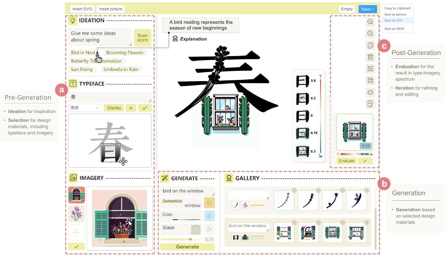
الشكل 5. واجهة TypeDance، مع منشئ يشارك في تصميم طباعة دلالي. (أ) في مرحلة ما قبل التوليد، يقوم المنشئ بتوليد أفكار ويختار نوع الخط والصور كمواد تصميم. (ب) خلال التوليد، يقوم المنشئ بتحديد خيارات التوليد مع تقديم نص لتخصيص التصميم. (ج) في مرحلة ما بعد التوليد، يقوم المنشئ بتقييم وتنقيح التصميم في طيف الخط والصورة.
6.3.2 التحرير والتصدير. تعيد أليس العملية لدمج ضربة “J” مع الصور الزهرية. تقوم بتحويلها إلى تنسيق SVG وتعدل لون الزهور. أخيرًا، قامت أليس بتصدير التصميم من خلال النقر على زر [حفظ] في الزاوية العلوية اليمنى من الواجهة.
7 التقييم
لاختبار فعالية TypeDance، أجرينا مقارنة أساسية ودراسة مستخدم. كان هدفنا الأساسي هو تقييم أداء النتائج المولدة وسهولة استخدام TypeDance، واستكشاف كيف يمكن لكل مكون أن يعالج نقاط الألم في سير العمل التصميمي. بالإضافة إلى ذلك، قمنا بالتعمق في قيود الأداة وحددنا فرص التحسين.
7.1 مقارنة الأساس
قمنا بإجراء مقارنة مع سبع طرق بديلة: Zhang et al. (M1)[61]، TReAT (M2)[48]، Word as Image (M3)[23]، DS-Fusion (M4)[47]، Depth2Image (M5)[34]، ControlNet (M6)[63]، Dalle 3 (M7)[5]. من أجل تقييم شامل، قمنا بتقييم هذه الطرق من منظورين تقني وإدراكي، كما هو موضح في الشكل 6. نظرًا لأن معظم الأعمال ليست مفتوحة المصدر، لم يكن من الممكن إجراء مقارنة شاملة باستخدام نفس الحالة. بدلاً من ذلك، قمنا بأخذ عينات عشوائية من ثلاث حالات من كل طريقة واستخدمنا TypeDance لإعادة إنشائها بنفس محتوى النص والصور، مع إجراء مقارنة واحدة لواحدة مع كل طريقة. الحالات الكاملة مدرجة في المواد التكميلية. شملت دراسة الإدراك استبيانًا عبر الإنترنت بمشاركة 50 فردًا. قمنا بخلط تسلسل الظهور لـ
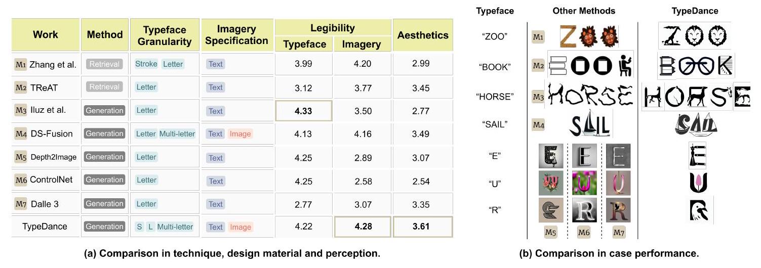
الشكل 6. TypeDance مقابل الأسس: (أ) مقارنة في التقنية، مادة التصميم، والإدراك، و(ب) مقارنة في أداء الحالة.
جميع الشعارات ولم تقدم أي تلميحات حول نوع الخط أو الصور المستخدمة، وتم تسجيل الدرجات على مقياس ليكرت من 5 نقاط.
7.1.1 الفرق في التقنية. تعمل الطباعة الفنية وTReAT على نهج قائم على الاسترجاع، مما يحد من قدرتها على التعميم على الحالات التي تختلف بشكل كبير عن القوالب المجمعة. بالمقابل، تتبنى طرق أخرى نهجًا قائمًا على التوليد، مما يوفر بعض التخفيف لهذه القيود. ومع ذلك، فإن معظمها مقيد بالدمج على مستوى الحروف، بينما تتفوق TypeDance من خلال دعم الدمج على جميع مستويات نوع الخط. فيما يتعلق بالتفاعل لتحديد الصور، تعتمد الغالبية العظمى من الطرق على النص، إما من خلال استرجاع القوالب ذات الصلة من مجموعة بيانات أو توجيه النموذج التوليدي. ومن الجدير بالذكر أن DS-Fusion وTypeDance تبرزان حيث تدعمان استخدام الصور لتعيين تمثيلات بصرية محددة. ومع ذلك، من المهم الإشارة إلى أن DS-Fusion تتطلب من المستخدمين تقديم مجموعة صغيرة من الصور تتكون من حوالي 20 صورة لضبط النموذج، وهي عملية تستغرق حوالي 1.5 ساعة باستخدام جهاز كمبيوتر مكتبي مزود ببطاقة Nvidia GeForce RTX 3090.
7.1.2 دراسة الإدراك. استخدمنا مقياسين رئيسيين لتقييم أداء هذه الطرق: أحدهما يركز على وضوح الخط والصور، والآخر على الجمالية. كما هو موضح في الشكل 6، يتفوق TypeDance على الطرق الأخرى في كل من درجة الجمالية ووضوح الصور. يحقق Word as Image أعلى درجة في وضوح الخط، لكن صورته تعتبر صعبة التعرف عليها بالمقارنة. وبالمثل، تظهر العديد من الطرق هذا الخلل، حيث تتفوق في تمثيل واحد بينما تضعف في الآخر. على النقيض من ذلك، يحافظ TypeDance على أداء مستقر مع اعتراف جمالي جدير بالثناء.
7.2 دراسة المستخدم
7.2.1 المشاركون. تم دعوة كل من المصممين والمستخدمين العامين (11 أنثى و7 ذكور، تتراوح أعمارهم بين 19-34) للحصول على تعليقات مختلفة. تسعة مشاركين (P1-P9) هم مستخدمون مبتدئون مهتمون بفن الطباعة الدلالية دون تدريب رسمي في التصميم. التسعة الآخرون هم مصممو جرافيك (E1-E9) لديهم تعليم تصميم احترافي مع أكثر من ثلاث سنوات من الخبرة في شعارات الطباعة الدلالية. جميع المشاركين قد جربوا أدوات الذكاء الاصطناعي مثل Midjourney من قبل. وقد وصلوا إلى TypeDance من خلال متصفحات الويب، مستخدمين مزيجًا من الأوضاع عبر الإنترنت وغير المتصلة. كعربون تقدير، تلقى كل مشارك
الشكل 7. المهمة الأولى للتقييم هي التقليد. في هذه المهمة، يُطلب من المستخدمين اختيار اثنين من ثلاثة مراجع وتقليد أسلوبهما. يتم عرض جزء من نتائج التصميم التي أنشأها المشاركون عبر TypeDance، مع تعليقات تشير إلى المواد التصميمية اللازمة، بما في ذلك نوع الخط والصور، وأنماط التصميم في تصاميمهم.
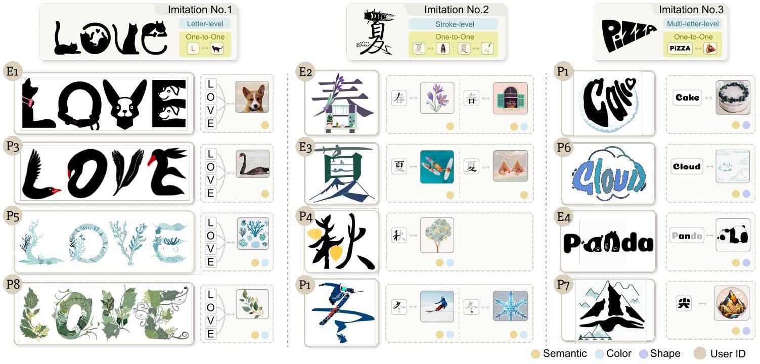
7.2.2 المهام والإجراءات. استلهمنا من عملية التصميم التي حددها أوكادا وآخرون [35]، والتي تحتوي على مرحلتين أساسيتين، وهما التقليد والإبداع، وقمنا بإعداد مهمتين وفقًا لذلك لتتناسب مع التحديات التصميمية الطبيعية والتقدمية. الإجراء الشامل موضح كما يلي:
-الإحاطة (20 دقيقة). قدمنا عدة أمثلة على الشعارات الطبوغرافية الدلالية من مجموعتنا المجمعة لتقديم الموضوع. لتسهيل الانتقال السريع للمشاركين إلى أدوارهم كمبدعين، استفسرنا عن تصميمهم المفضل وطلبنا منهم تخيل الخطوات المطلوبة لتحقيق مثل هذا التصميم. بعد ذلك، قدمنا TypeDance باستخدام المثال الموضح في الشكل 4. ثم تم تشجيع المشاركين على استكشاف TypeDance بشكل مستقل لمدة 5 دقائق لاكتساب مزيد من الألفة مع وظائفه.
-المهمة 1: التقليد (25 دقيقة). يُطلب من المشاركين اختيار اثنين من ثلاثة مراجع تصميم وتكرار أنماطها في تصاميمهم الخاصة. المرجع 1 يشجع المشاركين على دمج الصور التي تمثل شغفهم داخل نوع الخط “حب” على مستوى الحرف. المرجع 2 يسعى لدمج أكبر قدر ممكن من الصور، مع تصوير الفصول الأربعة داخل نوع الخط “春夏秋冬” على مستوى الضربات. المرجع 3 يركز على تشويه شكل الخطوط على مستوى الحروف المتعددة. تُظهر بعض نتائج تصميم المستخدمين في الشكل 7.
-المهمة 2: الإبداع (20 دقيقة). يُشجع المشاركون على استكشاف وإنشاء تصاميمهم الخاصة بحرية. بالنسبة لأولئك الذين ليس لديهم اتجاه إبداعي محدد، نقدم مواضيع مفتوحة مستمدة من مجموعتنا المجمعة (تعزيز الثقافة، العلامة التجارية للمنظمات، والهوية الشخصية) لإلهام الأفكار. يُشجع التفكير بصوت عالٍ خلال عملية الإبداع، وبعض نتائج تصميم المستخدمين موضحة في الشكل 8 والشكل 9.
-المقابلة (20 دقيقة). في النهاية، أكمل كل مشارك استبيانًا بمقياس ليكرت من 5 نقاط. ركز الاستبيان على ثلاثة جوانب من TypeDance: 1) رضا الناتج الناتج، 2) قابلية استخدام نظام TypeDance، و 3) وظيفة كل مكون فردي داخل النظام. بالإضافة إلى ذلك، أجرينا مقابلة شبه منظمة مع كل مشارك لجمع ملاحظاتهم حول عملية التصميم.
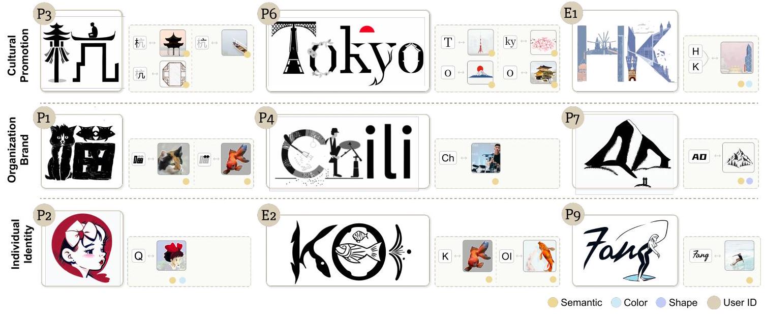
الشكل 8. المهمة التقييمية الثانية هي الإبداع. بالنسبة للمشاركين الذين ليس لديهم هدف إبداعي محدد، قدمنا مواضيع مفتوحة كإلهام. يتم عرض جزء من نتائج تصميم المواضيع المفتوحة التي أنشأها المشاركون عبر TypeDance، مع تعليقات تشير إلى المواد التصميمية اللازمة، بما في ذلك نوع الخط والصور، وأنماط التصميم في تصاميمهم.
7.3 تحليل النتائج
7.3.1 رضا الناتج الناتج. وجد جميع المشاركين أن الناتج الناتج يمزج بشكل فعال بين معلومات نوع الخط المختار والصور.
- الحفاظ. أعربت الغالبية العظمى من المشاركين (11/18) عن أن النتائج التي تم توليدها كانت “تفوق توقعاتهم” و”مبتكرة.” وجدوا أن TypeDance كان قادرًا على إنتاج نتائج معقولة تجمع بين نوع الخط والصورة بشكل فعال. كما ذكر P3، “لم أكن أرى في البداية أي علاقة بين البجعة والحرف ‘E’، لكن النتيجة أظهرت أنه يمكن دمجهما بطريقة visually pleasing (P3، الشكل 7).”
- التناغم. اتفق المشاركون (16/18) على أن النتائج الناتجة أظهرت تناغمًا جماليًا. نجح TypeDance في الحفاظ على وضوح نوع الخط بينما عزز الجاذبية البصرية من خلال دمج الصور التي “تتوافق مع هيكل النص (P1، P4، الشكل 7).”
- التنوع. وافق أكثر من نصف المشاركين على أن النتائج التي تم توليدها كانت متنوعة (14/18). بعض المشاركين (
) أكد على أهمية الحصول على تصاميم بديلة في الممارسة، وعلق قائلاً: “على الرغم من أنني حققت نتيجة مرضية، إلا أنني ما زلت أرغب في التجديد لرؤية نتائج أكثر إثارة (P2، الشكل 8؛ E7، الشكل 9).”
من حيث الحفظ، أظهر المستخدمون العامون حساسية أقل من المصممين في التعرف على نوع الخط والصور. على النقيض من ذلك، كان بإمكان المصممين إدراك المحتوى بسرعة وأظهروا ميلاً لتصدير التصاميم المحتملة إلى أدوات متقدمة لتعزيز الحفظ بشكل أكبر. على الرغم من اختلاف مستويات الخبرة في التصميم، أظهر كل من المستخدمين المبتدئين والمصممين درجات مشابهة من حيث التناغم وتنوع النتائج الناتجة. بالإضافة إلى التناغم الإدراكي، حدد المصممون المزيد من التأثيرات الفنية. كما علق E1، “لم أعتقد أبداً أن الذكاء الاصطناعي يمكن أن يفهم وينتج المساحة السلبية (الشكل 7).” في هذه الحالة، دمجت TypeDance الكلب في نوع الخط عن طريق ملء المساحة الفارغة
| مستخدم | عمر | جنس | مهنة | سيناريو | نية المستخدم | نوع الخط | صور | نتيجة | |||
| E5 | 34 | أنثى | مصممة |
|
شعار أنيق مع خاتم زفاف، والعروس والعريس يندمجان مع اسم الشركة بلِس. | بلِس |  |
|
|||
| E6 | 28 | ذكر | مصمم | منظمة بيئية | شعار مع الأرض وورقة لتسليط الضوء على التركيز البيئي. | إيكو فيجن | |
|
|||
| P9 | 19 | ذكر | طالب | نادي الهيب هوب | أريد أن أرتبط بالراقص مع حرفي ‘D’ لجعل شعارنا أكثر تأثيراً. | DtD | |
|
|||
| E7 | 26 | أنثى | مصممة | شركة ناشئة تكنولوجية | دمج عناصر تتعلق بالفن والتكنولوجيا في اسم الشركة. | آرت آل | |
|
|||
| E8 | 23 | أنثى | مصممة | مدونة القطط | أوريو هو قطة لديها العديد من المعجبين على وسائل التواصل الاجتماعي، وأحتاج إلى تصميم صورة ملف شخصي جديدة لها بناءً على صورتها واسمها. | أوريو | |
|
|||
| E9 | 29 | ذكر | مصمم | استوديو موسيقي | شعار مع نوتات موسيقية وجيتار يندمج مع اسم الاستوديو. | بيات | |
|
الشكل 9. في مهمة الإبداع، استخدم بعض المشاركين TypeDance لتلبية احتياجاتهم الإبداعية المحددة. بالنسبة لهؤلاء المشاركين، تم تسجيل معلوماتهم الشخصية، السيناريو، ونية الإبداع. بالإضافة إلى ذلك، تم عرض المواد التصميمية اللازمة، بما في ذلك نوع الخط والصور، جنبًا إلى جنب مع نتائج التصميم في الجدول.
في الرسالة
7.3.2 قابلية استخدام النظام. أظهرت دراسة المستخدم أن معظم المشاركين (
7.3.2 قابلية استخدام النظام. أظهرت دراسة المستخدم أن معظم المشاركين (
- سلامة. وافق معظم المشاركين
بشدة على أن سير العمل الكامل قد تم تجسيده داخل TypeDance. وأبرز أحد المشاركين، “لا أحتاج إلى التبديل بين منصات مختلفة لإنهاء تصميم (E2، الشكل 8).” - مرونة. وافق نصف المشاركين (
) بشدة على المرونة التي توفرها TypeDance لتخصيص تصاميمهم. جرب معظم المشاركين ( ) أكثر من نوعين من درجات نوع الخط في تصاميمهم. أشار E2 إلى، “يمكنني بسهولة اختيار ضربة واحدة تتداخل مع ضربات أخرى في نوع الخط.” - قابلية التحكم. وافق أكثر من نصف المشاركين (
) على أن TypeDance توفر مستوى عالٍ من القابلية للتحكم. وجدوا أن النتائج الناتجة كانت قادرة على “عكس الصور المختارة” و”الالتزام بالشكل المختار”. - قابلية التعديل. تم الاتفاق بشدة على قابلية تعديل TypeDance من قبل نصف المشاركين (
). أعرب العديد من المشاركين ( ) عن رغبتهم في أداة توليد لا تنتج التصاميم مرة واحدة فقط ولكن أيضًا توفر القدرة على إجراء التعديلات وتصحيح النتائج.
اعترف جميع المشاركين على نطاق واسع بسلامة سير العمل في TypeDance، مع وجهات نظر مختلفة من المصممين والمستخدمين العامين. قيم المصممون ذلك لدمجه الوظائف الأساسية التي تتطلب عادةً التبديل بين منصات مختلفة في سير العمل التقليدي، بينما أشاد المستخدمون العامون بـ TypeDance لأنها تسمح لهم بمتابعة المكونات في الواجهة بشكل متسلسل لإنهاء تصميم. يتطلب الشعار تخصيصًا عاليًا بخصائصه الخاصة

الشكل 10. تقييمات المستخدمين لـ TypeDance، بما في ذلك (أ) رضا عن النتيجة الناتجة، (ب) قابلية استخدام النظام، و (ج) فائدة الوظيفة الفردية. تظهر الرسوم البيانية الثلاثة المكدسة أعلاه تقييم المستخدم العام لمؤشرات مختلفة لـ TypeDance، بينما توضح الرسوم البيانية الثلاثة أدناه التفضيلات المميزة بين الخبراء والمبتدئين، مع عرض قيم التقييم المتوسطة لهاتين المجموعتين من المستخدمين.
لكشف الهوية. تضيف الخيار لاختيار الصور من الصور الشخصية لمسة شخصية، متجاوزة الموارد المتاحة في مجتمع مشترك. أكد كل من المصممين والمبتدئين على القدرة على التحكم واستلهام الإلهام من العالم الحقيقي مع تمثيل بصري محدد، لون، وشكل. هذه الميزة مهمة بشكل خاص في بعض السيناريوهات، مثل “تصميم شعار مدينة.”
الفجوة بين المرونة وقابلية التعديل توضح التوقعات المختلفة من المصممين والمستخدمين العامين. أظهر المستخدمون العامون اهتمامًا أقل في تجربة درجات مختلفة من نوع الخط، مستخدمين بشكل أساسي دمج مستوى الحرف. من ناحية أخرى، أشاد المصممون بشدة بهذه الوظيفة لأنها تسمح لهم بتقسيم أجزاء مختلفة من نوع الخط أو حتى الدمج عبر درجات مختلفة. بعد الحصول على النتائج الناتجة، يعبر المستخدمون العامون عن رضاهم عن تغيير الألوان أو حذف العناصر (P4 & P6، الشكل 8). يجد المصممون متعة في وظيفة التنقيح، كما يشير E5 “إنها تحاكي عملية التصميم الحقيقية حيث يتم تبسيط الصور تدريجيًا أو إضافة تفاصيل إلى نوع الخط (E5، الشكل 9).” كما أعربوا عن رغبتهم في المزيد من وظائف التحرير المتقدمة، مثل منحنيات بيزير، لضبط الأشكال.
7.3.3 فائدة الوظائف الفردية. قدم المشاركون أيضًا تقييمات لكل مكون داخل نظام TypeDance. حصلت مكونات الاختيار والتوليد على اتفاق بالإجماع من جميع المشاركين، مع درجات عالية وقابلة للمقارنة. كان للتناسق بين اختيار نوع الخط والصور والنظر في عوامل التصميم، مثل إعداد المواد التصميمية، تأثير مباشر على درجات مكونات الاختيار والتوليد. قال E3، “يوفر لي الكثير من الوقت لاختيار نوع الخط المطلوب وضبط منحنيات البيزير لإنشاء أشكال تشبه أشياء معينة، مثل كلب.” كما قدروا النطاق المتنوع من النتائج التي يقدمها النظام، والتي وجدوا أنها حاسمة لعملية التصميم (
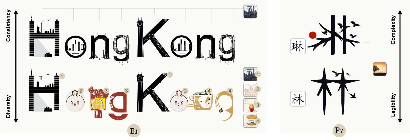
الشكل 11. التبادلات التي تم الكشف عنها في حالات المشاركين. الشكل على اليسار يظهر التبادل بين تنوع الصور وتناسق الأسلوب، حيث سيؤدي العدد المتزايد من الصور إلى اختلافات في الأسلوب. الشكل على الجانب الأيمن يظهر التبادل بين تعقيد نوع الخط وقابلية القراءة، حيث قد يؤدي زيادة تعقيد نوع الخط إلى انخفاض محتمل في قابلية قراءة النتائج.
7.4 قيود
استجابةً للمشكلات التي واجهها المستخدمون أثناء استخدام TypeDance، حددنا القيود الرئيسية للنظام الحالي من ثلاثة أبعاد.
7.4.1 التجربة والخطأ في اختيار نوع الخط والصور. على الرغم من أن TypeDance الحالي يسمح للمبدعين بالاختيار والدمج بشكل مرن، مما يسهل التوليد السريع، تشير ملاحظات المشاركين إلى أن التجربة والخطأ مع التوافق غير المتجانس بين نوع الخط والصور قد تطيل عملية الإبداع. على سبيل المثال، حقق E9 التصميم النهائي بعد ثلاث محاولات، حيث جرب درجات مختلفة من نوع الخط، بما في ذلك “Bea”، ”
7.4.2 التوازن بين تنوع الصور وتناسق نمط النتيجة. توضح الشكل 11 هذه القيود، حيث يؤدي استخدام نفس الصورة لـ “هونغ كونغ” إلى إنتاج نتيجة متناسقة من الناحية الأسلوبية، بينما يؤدي استخدام صور مختلفة إلى عدم تناسق ملحوظ. علق E1، “تبدو هذه العناصر جيدة بشكل فردي، ولكن عند دمجها، تظهر غير متناسقة.” ينشأ هذا التناقض من نقل الصور والأسلوب من مراجع الصور إلى النتيجة الناتجة، مما يؤدي إلى أنماط متنوعة عند استخدام مراجع متعددة. بينما يعد إضافة موجه نصي حلاً جزئيًا لتخفيف هذه المشكلة، إلا أنه يفتقر إلى التحكم الدقيق. إن دمج صور متعددة ضمن نوع خط واحد هو تنسيق شائع ومهم لشعارات الطباعة الدلالية. وبالتالي، فإن تحقيق التحكم الدقيق في تنوع الصور وتناسق نمط النتيجة يبقى مجالًا مهمًا لمزيد من التحقيق.
7.4.3 التوازن بين تعقيد نوع الخط وقابلية قراءة النتيجة. عندما يرتفع تعقيد نوع الخط المستخدم في الإبداع (على سبيل المثال، زيادة الخطوط أو الحروف)، قد تنخفض قابلية قراءة النتيجة الناتجة بشكل متناسب. كما يظهر الجانب الأيمن من الشكل 11، عند استخدام نفس الصورة خلال عملية الإبداع، فإن توضيح “林” سهل القراءة، بينما يظهر تقديم “琳” بشكل أكثر تجريدًا. يشير ذلك إلى أن القدرة الحالية على التوليد في TypeDance لا يمكن أن تؤدي بشكل جيد في الحالات التي تحتوي على نوع خط معقد، مثل كلمة صينية كاملة، أو عدة حروف. السبب الرئيسي هو أن نوع الخط المعقد يوفر هيكلًا غنيًا في البداية للنموذج التوليدي ليقوم بتصميمه. لمواجهة
هذه المشكلة، يجب على TypeDance إيجاد حل قابل للتطبيق لتعزيز التحكم في عملية التصميم أثناء التوليد، لتحقيق توازن بين تعقيد نوع الخط وقابلية القراءة.
8 المناقشة
8.1 التصميم الشخصي: التعاون المدرك للنية مع الذكاء الاصطناعي
أدى ظهور نماذج اللغة الكبيرة إلى زيادة كبيرة في تصميم الإبداع المدفوع بالنص [6،51،58]، مما يمكّن المبدعين من التعاون مع الذكاء الاصطناعي باستخدام السرد بلغة طبيعية. بينما يوفر الإبداع المدفوع بالنص وسيلة بديهية للتلاعب بالنموذج في الخلفية دون الخوض في معلمات معقدة يدويًا، فإن التعبير عن نية المستخدم بشكل مختصر من خلال الموجهات النصية يمثل تحديًا. يصبح صياغة الموجه أمرًا صعبًا بشكل خاص عند وصف تصميم بصري متخيل، نظرًا للعديد من التفاصيل مثل التخطيط، واللون، والشكل التي تتجاوز التمثيل النصي. يعترف PromptPaint [10] بهذا التحدي ويقترب منه من خلال مزج مجموعة من الموجهات النصية لالتقاط المفاهيم الغامضة، مثل “لون أقل حيوية قليلاً.” ومع ذلك، لا يزال مقيدًا بتقديم مجموعة محددة مسبقًا من الموجهات ويفشل أساسًا في حل مشكلة تمثيل المفاهيم البصرية الملموسة من خلال الموجهات.
لضمان توافق نية المبدع بسلاسة مع التعاون مع الذكاء الاصطناعي، من الضروري عكس الممارسات التصميمية الحقيقية مع مواد تصميم متاحة. تشمل المواد التصميمية الشائعة المستخدمة من قبل المبدعين المعارض القابلة للاستكشاف [60]، والرسومات [11]، وحتى الصور التي تلتقط إدراكنا للعالم [31، 62]. تشمل هذه المواد التصميمية البصرية كل من النوايا الصريحة، مثل الدلالات البارزة، والعوامل الجمالية الضمنية. في تصميم الشعار، هناك تركيز ملحوظ على الهوية، باستخدام الصور بشكل متكرر لنقل النوايا. لا يمكن تجاهل هذا الجانب في التعاون مع الذكاء الاصطناعي، مما يتطلب قدرة للذكاء الاصطناعي على فهم الدلالات البصرية. يكشف ذلك أنه لا يوجد مادة متفوقة عالميًا لتجسيد نية المبدع؛ بل يعتمد على مهمة التصميم. يتطلب ذلك تعاونًا هجينًا ومتعدد الوسائط يمكن أن يتعمم بمرونة على مجموعة واسعة من المتطلبات.
8.2 دمج المعرفة التصميمية في أدوات دعم الإبداع
يتطلب غرس نمط التصميم القابل للتعميم في الأدوات معالجة التحديات التقنية والتفاعلية المتعلقة بكيفية توجيه البشر للنموذج. غالبًا ما لا تُبنى نماذج الذكاء الاصطناعي لمهمة التصميم الخاصة، مما يطرح تحديات في التعميم على الأنماط المعقدة. على سبيل المثال، تناولت أبحاث كبيرة [47،61] تقنيات الدمج لدرجات معينة من نوع الخط. ومع ذلك، فإن أدوات دعم الإبداع موجهة نحو المستخدم، مع متطلبات تصميم أكثر تعقيدًا، مما يتطلب تقنيات متقدمة لاستيعاب جميع مستويات درجات نوع الخط. بدلاً من إعادة تدريب نموذج، استكشفت أبحاث كبيرة تغيير أو إضافة التفاعل مع النماذج لدمج المعرفة التصميمية، مثل تحديد معلمات التصميم المدعومة من الجمهور [27] والتدخل من خلال التمثيلات الوسيطة [57].
تظهر الجوانب التقنية والتفاعلية لدمج المعرفة التصميمية فكرة “موازنة الأتمتة والتحكم”، والتي غالبًا ما يتم الإشارة إليها من قبل إرشادات التصميم الحالية بين البشر والذكاء الاصطناعي [1،2،19]. إن دمج المعرفة التصميمية التي يتحكم فيها المبدعون يعالج جزئيًا مشكلة حقوق الطبع والنشر للذكاء الاصطناعي. واجهت النماذج التوليدية الحالية انتقادات بسبب أخذ عينات من أمثلة من مجموعة التدريب. في TypeDance، يساهم المستخدمون بمواد تصميم من خلال الصور، مما يسمح بأساس شخصي بدلاً من النسخ المباشر من مجموعة بيانات محددة مسبقًا. لا تعزز هذه الطريقة الإبداع فحسب، بل تساعد أيضًا في إنشاء شعور أقوى بالملكية للمبدعين. إن الأتمتة الكاملة باستخدام نموذج واحد لتحقيق نتيجة شاملة تتجاهل قيمة المستخدم. تكمن جاذبية أداة دعم الإبداع، بدلاً من الاعتماد فقط على نموذج، في تمكين المبدعين من المشاركة في المراحل الحاسمة. تشمل هذه المشاركة تخصيص مواد التصميم، واختيار المعرفة التصميمية التي سيتم نقلها إلى عملية التوليد، وتنقيح النتيجة النهائية.
8.3 سير العمل التصميمي الموجه للمستخدم المختلط
بهدف تطوير أداة ذات “عتبة منخفضة” للمبتدئين لتوجيه التوليد و”سقف مرتفع” للخبراء لتحقيق تأثيرات أكثر تقدمًا، يدمج TypeDance سير عمل تصميم قابل للمحاكاة. تم تصميم أدوات دعم الإبداع بطبيعتها لتوفير تجربة تأليف شاملة، تعالج كل من التركيزات الشائعة والفريدة من مستخدمين متنوعين [57، 58، 65]. كما هو موضح في الشكل 10، يشارك الخبراء والمصممون تفضيلات مشابهة ومتميزة. يمكن اعتبار الوظائف ذات التفضيلات المشتركة، مثل الاختيار والتوليد، مركزية في سير العمل وتستحق تحقيقًا أعمق. من الجدير بالذكر أن هناك وظائف ذات تفضيلات متباينة بناءً على الخبرة. يميل الخبراء إلى إعطاء الأولوية للتقييم والتنقيح، بينما قد يرى المبتدئون هذه كخيارات اختيارية. ومع ذلك، مع خلفية تصميم أقل، يجد المبتدئون أن الإبداع مفيد أكثر من الخبراء. تعمل الوظائف ذات التفضيلات المختلفة كـ “جدار واسع”، تستوعب متطلبات المستخدم الاختيارية. بينما ليست إلزامية مثل الوظائف المركزية، فإن إغفالها يضر بالنزاهة العامة لسير العمل.
9 الخاتمة
تستخلص هذه الدراسة معرفة التصميم من أمثلة العالم الحقيقي، وتلخص أنماط التصميم القابلة للتعميم وسير العمل التصميمي القابل للمحاكاة، وتستكشف إنشاء شعارات طباعة دلالية من خلال دمج الخطوط والصور مع الحفاظ على القابلية للقراءة. نقدم TypeDance، أداة تأليف تعتمد على نموذج توليدي يدعم سير عمل تصميم مخصص يشمل التفكير، والاختيار، والتوليد، والتقييم، والتكرار. مع TypeDance، يمكن للمبدعين اختيار الخطوط بشكل مرن على مستويات مختلفة من الدقة ودمجها مع صور محددة باستخدام عوامل تصميم قابلة للجمع. كما يسمح TypeDance للمستخدمين بضبط النتائج المولدة على طيف الخط-الصورة ويقدم تحريرًا لاحقًا للعناصر الفردية. تؤكد تعليقات المستخدمين العامين والخبراء فعالية TypeDance وتوفر رؤى قيمة لفرص المستقبل. نحن متحمسون لتعزيز وظائف TypeDance لسير عمل شامل واستكشاف تقنيات وتفاعلات جديدة لتعزيز الإبداع البشري.
REFERENCES
[1] Saleema Amershi, Dan Weld, Mihaela Vorvoreanu, Adam Fourney, Besmira Nushi, Penny Collisson, Jina Suh, Shamsi Iqbal, Paul N Bennett, Kori Inkpen, et al. 2019. Guidelines for human-AI interaction. In Proceedings of the 2019 chi conference on human factors in computing systems. 1-13.
[2] Apple. 2021. Human Interface Guidelines. https://developer.apple.com/design/human-interface-guidelines/, Last accessed on 2023-12-13.
[3] Gregory Ashworth and Mihalis Kavaratzis. 2009. Beyond the logo: Brand management for cities. Journal of Brand Management 16 (2009), 520-531.
[4] Daniel Berio, Frederic Fol Leymarie, Paul Asente, and Jose Echevarria. 2022. Strokestyles: Stroke-based segmentation and stylization of fonts. ACM Transactions on Graphics 41, 3, Article 28 (2022), 21 pages.
[5] James Betker, Gabriel Goh, Li Jing, Tim Brooks, Jianfeng Wang, Linjie Li, Long Ouyang, Juntang Zhuang, Joyce Lee, Yufei Guo, et al. 2023. Improving image generation with better captions. Computer Science. https://cdn. openai. com/papers/dall-e-3. pdf (2023).
[6] Yining Cao, Jane L E, Zhutian Chen, and Haijun Xia. 2023. DataParticles: Block-based and language-oriented authoring of animated unit visualizations. In Proceedings of the 2023 CHI Conference on Human Factors in Computing Systems. 1-15.
[7] Terry L Childers and Jeffrey Jass. 2002. All dressed up with something to say: Effects of typeface semantic associations on brand perceptions and consumer memory. Journal of Consumer Psychology 12, 2 (2002), 93-106.
[8] Lydia B Chilton, Ecenaz Jen Ozmen, Sam H Ross, and Vivian Liu. 2021. VisiFit: Structuring iterative improvement for novice designers. In Proceedings of the CHI Conference on Human Factors in Computing Systems. Association for Computing Machinery, 1-14.
[9] Lydia B Chilton, Savvas Petridis, and Maneesh Agrawala. 2019. VisiBlends: A flexible workflow for visual blends. In Proceedings of the CHI Conference on Human Factors in Computing Systems. Association for Computing Machinery, 1-14.
[10] John Joon Young Chung and Eytan Adar. 2023. PromptPaint: Steering Text-to-Image Generation Through Paint Medium-like Interactions. In Proceedings of the 36th Annual ACM Symposium on User Interface Software and Technology. 1-17.
[11] John Joon Young Chung, Wooseok Kim, Kang Min Yoo, Hwaran Lee, Eytan Adar, and Minsuk Chang. 2022. TaleBrush: Sketching stories with generative pretrained language models. In Proceedings of the 2022 CHI Conference on Human Factors in Computing Systems. 1-19.
[12] Weiwei Cui, Xiaoyu Zhang, Yun Wang, He Huang, Bei Chen, Lei Fang, Haidong Zhang, Jian-Guan Lou, and Dongmei Zhang. 2019. Text-to-viz: Automatic generation of infographics from proportion-related natural language statements. IEEE Transactions on Visualization and Computer Graphics 26, 1 (2019), 906-916.
[13] João M Cunha, Nuno Lourenço, Pedro Martins, and Penousal Machado. 2020. Visual blending for concept representation: A case study on emoji generation. New Generation Computing 38, 4 (2020), 739-771.
[14] Laura Devendorf and Kimiko Ryokai. 2013. AnyType: provoking reflection and exploration with aesthetic interaction. In Proceedings of the SIGCHI Conference on Human Factors in Computing Systems. 1041-1050.
[15] Ryan Dew, Asim Ansari, and Olivier Toubia. 2022. Letting logos speak: Leveraging multiview representation learning for data-driven branding and logo design. Marketing Science 41, 2 (2022), 401-425.
[16] Evelyn Fix and Joseph Lawson Hodges. 1989. Discriminatory analysis. Nonparametric discrimination: Consistency properties. International Statistical Review/Revue Internationale de Statistique 57, 3 (1989), 238-247.
[17] Rinon Gal, Yuval Alaluf, Yuval Atzmon, Or Patashnik, Amit H. Bermano, Gal Chechik, and Daniel Cohen-Or. 2022. An Image is Worth One Word: Personalizing Text-to-Image Generation using Textual Inversion. arXiv:2208.01618
[18] Rinon Gal, Or Patashnik, Haggai Maron, Amit H Bermano, Gal Chechik, and Daniel Cohen-Or. 2022. StyleGAN-NADA: CLIP-guided domain adaptation of image generators. ACM Transactions on Graphics 41, 4, Article 141 (2022), 13 pages.
[19] Google. 2019. People + AI Guidebook. https://pair.withgoogle.com/, Last accessed on 2023-12-13.
[20] Pamela W Henderson and Joseph A Cote. 1998. Guidelines for selecting or modifying logos. Fournal of Marketing 62, 2 (1998), 14-30.
[21] Yon Ade Lose Hermanto. 2023. Semantic Interpretation in Experimental Typography Creation. KnE Social Sciences 8, 15 (2023), 252-257.
[22] Kai-Wen Hsiao, Yong-Liang Yang, Yung-Chih Chiu, Min-Chun Hu, Chih-Yuan Yao, and Hung-Kuo Chu. 2023. Img2Logo: Generating Golden Ratio Logos from Images. In Computer Graphics Forum, Vol. 42. Wiley Online Library, 37-49.
[23] Shir Iluz, Yael Vinker, Amir Hertz, Daniel Berio, Daniel Cohen-Or, and Ariel Shamir. 2023. Word-As-Image for Semantic Typography. ACM Transactions on Graphics 42, 4, Article 151 (2023), 11 pages.
[24] Youwen Kang, Zhida Sun, Sitong Wang, Zeyu Huang, Ziming Wu, and Xiaojuan Ma. 2021. MetaMap: Supporting visual metaphor ideation through multi-dimensional example-based exploration. In Proceedings of the CHI Conference on Human Factors in Computing Systems. Association for Computing Machinery, Article 427, 15 pages.
[25] Alexander Kirillov, Eric Mintun, Nikhila Ravi, Hanzi Mao, Chloe Rolland, Laura Gustafson, Tete Xiao, Spencer Whitehead, Alexander C. Berg, Wan-Yen Lo, Piotr Dollár, and Ross Girshick. 2023. Segment Anything. arXiv:2304.02643
[26] Janin Koch, Andrés Lucero, Lena Hegemann, and Antti Oulasvirta. 2019. May AI? Design ideation with cooperative contextual bandits. In Proceedings of the CHI Conference on Human Factors in Computing Systems. Association for Computing Machinery, 1-12.
[27] Yuki Koyama, Daisuke Sakamoto, and Takeo Igarashi. 2014. Crowd-powered parameter analysis for visual design exploration. In Proceedings of the 27th annual ACM symposium on User interface software and technology. 65-74.
[28] Jieun Lee, Eunju Ko, and Carol M Megehee. 2015. Social benefits of brand logos in presentation of self in cross and same gender influence contexts. Journal of Business Research 68, 6 (2015), 1341-1349.
[29] Junnan Li, Dongxu Li, Caiming Xiong, and Steven Hoi. 2022. Blip: Bootstrapping language-image pre-training for unified vision-language understanding and generation. In Proceedings of the International Conference on Machine Learning, Vol. 162. PMLR, 12888-12900.
[30] Yi-Na Li, Kang Zhang, and Dong-Jin Li. 2017. Rule-based automatic generation of logo designs. Leonardo 50, 2 (2017), 177-181.
[31] Giorgia Lupi and Stefanie Posavec. 2018. Observe, collect, draw!: A visual journal: Discover the patterns in your everyday life. Princeton Architectural Press.
[32] O Mataev and H Mataev. 2006. Olga’s gallery. giuseppe Arcimboldo.
[33] Mark Meyer, Alan Barr, Haeyoung Lee, and Mathieu Desbrun. 2002. Generalized barycentric coordinates on irregular polygons. Journal of Graphics Tools 1 (2002), 13-22.
[34] Chong Mou, Xintao Wang, Liangbin Xie, Jian Zhang, Zhongang Qi, Ying Shan, and Xiaohu Qie. 2023. T2i-adapter: Learning adapters to dig out more controllable ability for text-to-image diffusion models. arXiv:2302.08453
[35] Takeshi Okada and Kentaro Ishibashi. 2017. Imitation, inspiration, and creation: Cognitive process of creative drawing by copying others’ artworks. Cognitive Science 41, 7 (2017), 1804-1837.
[36] Long Ouyang, Jeffrey Wu, Xu Jiang, Diogo Almeida, Carroll Wainwright, Pamela Mishkin, Chong Zhang, Sandhini Agarwal, Katarina Slama, Alex Ray, et al. 2022. Training language models to follow instructions with human feedback. Advances in Neural Information Processing Systems 35 (2022), 27730-27744.
[37] Helen Petrie, Fraser Hamilton, and Neil King. 2004. Tension, what tension? Website accessibility and visual design. In Proceedings of the International Cross-Disciplinary Workshop on Web Accessibility, Vol. 63. Association for Computing Machinery, 13-18.
[38] Huy Quoc Phan, Hongbo Fu, and Antoni B Chan. 2015. Flexyfont: Learning transferring rules for flexible typeface synthesis. In Computer Graphics Forum, Vol. 34. Wiley Online Library, 245-256.
[39] Alec Radford, Jong Wook Kim, Chris Hallacy, Aditya Ramesh, Gabriel Goh, Sandhini Agarwal, Girish Sastry, Amanda Askell, Pamela Mishkin, Jack Clark, et al. 2021. Learning transferable visual models from natural language supervision. In Proceedings of the International Conference on Machine Learning, Vol. 139. PMLR, 8748-8763.
[40] Aditya Ramesh, Prafulla Dhariwal, Alex Nichol, Casey Chu, and Mark Chen. 2022. Hierarchical text-conditional image generation with clip latents. arXiv:2204.06125
[41] Aditya Ramesh, Mikhail Pavlov, Gabriel Goh, Scott Gray, Chelsea Voss, Alec Radford, Mark Chen, and Ilya Sutskever. 2021. Zero-shot text-to-image generation. In Proceedings of the International Conference on Machine Learning, Vol. 139. PMLR, 8821-8831.
[42] Robin Rombach, Andreas Blattmann, Dominik Lorenz, Patrick Esser, and Björn Ommer. 2022. High-Resolution Image Synthesis With Latent Diffusion Models. In Proceedings of the IEEE/CVF Conference on Computer Vision and Pattern Recognition. IEEE, 10684-10695.
[43] Subhadip Roy and Rekha Attri. 2022. Physimorphic vs. Typographic logos in destination marketing: Integrating destination familiarity and consumer characteristics. Tourism Management 92 (2022), 104544.
[44] Patsorn Sangkloy, Wittawat Jitkrittum, Diyi Yang, and James Hays. 2022. A sketch is worth a thousand words: Image retrieval with text and sketch. In Proceedings of the European Conference on Computer Vision. Springer, 251-267.
[45] Yang Shi, Pei Liu, Siji Chen, Mengdi Sun, and Nan Cao. 2022. Supporting expressive and faithful pictorial visualization design with visual style transfer. IEEE Transactions on Visualization and Computer Graphics 29, 1 (2022), 236-246.
[46] Ben Shneiderman. 2007. Creativity support tools: accelerating discovery and innovation. Commun. ACM 50, 12 (2007), 20-32.
[47] Maham Tanveer, Yizhi Wang, Ali Mahdavi-Amiri, and Hao Zhang. 2023. DS-Fusion: Artistic Typography via Discriminated and Stylized Diffusion. In Proceedings of the International Conference on Computer Vision. IEEE.
[48] Purva Tendulkar, Kalpesh Krishna, Ramprasaath R Selvaraju, and Devi Parikh. 2019. Trick or TReAT: Thematic reinforcement for artistic typography. arXiv:1903.07820
[49] Dimitri von Rütte, Elisabetta Fedele, Jonathan Thomm, and Lukas Wolf. 2023. FABRIC: Personalizing Diffusion Models with Iterative Feedback. arXiv:2307.10159
[50] Yizhi Wang, Yue Gao, and Zhouhui Lian. 2020. Attribute2font: Creating fonts you want from attributes. ACM Transactions on Graphics 39, 4, Article 69 (2020), 15 pages.
[51] Yun Wang, Zhitao Hou, Leixian Shen, Tongshuang Wu, Jiaqi Wang, He Huang, Haidong Zhang, and Dongmei Zhang. 2022. Towards natural language-based visualization authoring. IEEE Transactions on Visualization and Computer Graphics 29, 1 (2022), 1222-1232.
[52] Yizhi Wang, Guo Pu, Wenhan Luo, Yexin Wang, Pengfei Xiong, Hongwen Kang, and Zhouhui Lian. 2022. Aesthetic text logo synthesis via content-aware layout inferring. In Proceedings of the IEEE/CVF Conference on Computer Vision and Pattern Recognition. IEEE, 2436-2445.
[53] Jason Wei, Xuezhi Wang, Dale Schuurmans, Maarten Bosma, Fei Xia, Ed Chi, Quoc V Le, Denny Zhou, et al. 2022. Chain-of-thought prompting elicits reasoning in large language models. Advances in Neural Information Processing Systems 35 (2022), 24824-24837.
[54] Shishi Xiao, Suizi Huang, Yue Lin, Yilin Ye, and Wei Zeng. 2023. Let the Chart Spark: Embedding Semantic Context into Chart with Text-to-Image Generative Model. arXiv:2304.14630
[55] Jie Xu and Craig S Kaplan. 2007. Calligraphic packing. In Proceedings of Graphics Interface. Association for Computing Machinery, 43-50.
[56] Xiaotong Xu, Rosaleen Xiong, Boyang Wang, David Min, and Steven P Dow. 2021. Ideaterelate: An examples gallery that helps creators explore ideas in relation to their own. Proceedings of the ACM on Human-Computer Interaction 5, CSCW2, Article 352(2021), 18 pages.
[57] Chuan Yan, John Joon Young Chung, Yoon Kiheon, Yotam Gingold, Eytan Adar, and Sungsoo Ray Hong. 2022. FlatMagic: Improving flat colorization through AI-driven design for digital comic professionals. In Proceedings of the 2022 CHI Conference on Human Factors in Computing Systems. 1-17.
[58] Zihan Yan, Chunxu Yang, Qihao Liang, and Xiang’Anthony’ Chen. 2023. XCreation: A Graph-based Crossmodal Generative Creativity Support Tool. In Proceedings of the 36th Annual ACM Symposium on User Interface Software and Technology. 1-15.
[59] Shuai Yang, Jiaying Liu, Zhouhui Lian, and Zongming Guo. 2017. Awesome typography: Statistics-based text effects transfer. In Proceedings of the IEEE/CVF Conference on Computer Vision and Pattern Recognition. IEEE, 7464-7473.
[60] Enhao Zhang and Nikola Banovic. 2021. Method for exploring generative adversarial networks (gans) via automatically generated image galleries. In Proceedings of the 2021 CHI Conference on Human Factors in Computing Systems. 1-15.
[61] Junsong Zhang, Yu Wang, Weiyi Xiao, and Zhenshan Luo. 2017. Synthesizing ornamental typefaces. In Computer Graphics Forum, Vol. 36. Wiley Online Library, 64-75.
[62] Jiayi Eris Zhang, Nicole Sultanum, Anastasia Bezerianos, and Fanny Chevalier. 2020. DataQuilt: Extracting visual elements from images to craft pictorial visualizations. In Proceedings of the CHI Conference on Human Factors in Computing Systems. Association for Computing Machinery, 1-13.
[63] Lvmin Zhang and Maneesh Agrawala. 2023. Adding conditional control to text-to-image diffusion models. arXiv:2302.05543
[64] Nanxuan Zhao, Nam Wook Kim, Laura Mariah Herman, Hanspeter Pfister, Rynson WH Lau, Jose Echevarria, and Zoya Bylinskii. 2020. Iconate: Automatic compound icon generation and ideation. In Proceedings of the CHI Conference on Human Factors in Computing Systems. Association for Computing Machinery, 1-13.
[65] Tongyu Zhou, Connie Liu, Joshua Kong Yang, and Jeff Huang. 2023. filtered. ink: Creating Dynamic Illustrations with SVG Filters. In Proceedings of the 2023 CHI Conference on Human Factors in Computing Systems. 1-15.
[66] Changqing Zou, Junjie Cao, Warunika Ranaweera, Ibraheem Alhashim, Ping Tan, Alla Sheffer, and Hao Zhang. 2016. Legible compact calligrams. ACM Transactions on Graphics 35, 4, Article 122 (2016), 12 pages.
Received 20 February 2007; revised 12 March 2009; accepted 5 June 2009
- Permission to make digital or hard copies of all or part of this work for personal or classroom use is granted without fee provided that copies are not made or distributed for profit or commercial advantage and that copies bear this notice and the full citation on the first page. Copyrights for components of this work owned by others than ACM must be honored. Abstracting with credit is permitted. To copy otherwise, or republish, to post on servers or to redistribute to lists, requires prior specific permission and/or a fee. Request permissions from permissions@acm.org.
© 2018 Association for Computing Machinery.
Manuscript submitted to ACM
TypeDance: Creating Semantic Typographic Logos from Image through Personalized Generation
Fig. 1. TypeDance is an authoring tool for creating semantic typographic logos with a flexible and personalized design. By distilling the design principles, it instantiates the design workflow and empowers creators to (a) ideate with an interpretable AI agent, (b) select the typeface at different granularity and imagery from images, (c) generate through blending the selected typeface with targeted imagery, then the creator can (d) evaluate and (e) iterate the position of generated result in the type-imagery spectrum.
Semantic typographic logos harmoniously blend typeface and imagery to represent semantic concepts while maintaining legibility. Conventional methods using spatial composition and shape substitution are hindered by the conflicting requirement for achieving seamless spatial fusion between geometrically dissimilar typefaces and semantics. While recent advances made AI generation of semantic typography possible, the end-to-end approaches exclude designer involvement and disregard personalized design. This paper presents TypeDance, an AI-assisted tool incorporating design rationales with the generative model for personalized semantic typographic logo design. It leverages combinable design priors extracted from uploaded image exemplars and supports type-imagery mapping at various structural granularity, achieving diverse aesthetic designs with flexible control. Additionally, we instantiate a comprehensive design workflow in TypeDance, including ideation, selection, generation, evaluation, and iteration. A two-task user evaluation, including imitation and creation, confirmed the usability of TypeDance in design across different usage scenarios.
CCS Concepts:
- Computing methodologies
Artificial intelligence.
Additional Key Words and Phrases: semantic typography, generative model, personalized design
ACM Reference Format:
Shishi Xiao, Liangwei Wang, Xiaojuan Ma, and Wei Zeng. 2018. TypeDance: Creating Semantic Typographic Logos from Image through Personalized Generation. In . ACM, New York, NY, USA, 24 pages. https://doi.org/XXXXXXX.XXXXXXX
1 INTRODUCTION
Semantic typography is the art of blending typeface and imagery, where the typeface is conceptualized as a visual illustration of semantic representation with high clarity and legibility [21,23,47]. One notable application is the semantic typographic logo, which symbolizes a unique identity in a concise yet informative manner. Due to its expressiveness and memorability [7], semantic typographic logo has been widely used as visual signatures for individuals [28], brand logos with commercial values [15, 20], and symbols for significant events and city promotions [3, 43].
However, crafting a semantic typographic logo presents a formidable challenge, requiring seamless blending of typeface and imagery while preserving readability. Experienced designers often rely on professional software like Adobe Illustrator to manually adjust the outline of the typeface to incorporate specific imagery, which is a time-consuming and error-prone process. They often experiment with different strokes or letters of typeface and various imageries to find a visually appealing and memorable representation, intensifying the lengthy process. This requires creative thinking, practical skills, and the ability to persist through continuous trial and error. In addition, the unique identity of a logo necessitates a high level of customization and personalization in the design process.
There are two main challenges in extensive relevant research: blending technique and intent-aware authoring. Existing authoring tools leverage various blending techniques to create other types of designs, e.g., graphical icons. As shown in Fig. 3, One typical technique aims to spatially composite existing materials [13, 64]. Another technique uses shape substitution to achieve a more spatial merge, but it heavily depends on the shape similarity between the objects being blended [8, 9]. Although some computational design techniques support incorporating imagery into typefaces, they are constrained by the ability to change specific parts of typefaces [4, 23, 48]. Advancements in text-to-image generative models [42,63] have made it possible to generate semantic typography automatically, but it poses another challenge about intent-aware authoring. Given the myriad details such as specific visual presentation (e.g., semantics, color, and shape) in a logo design, text prompts may not be able to represent these intents.
This research aims to gain insights into the design space and workflow involved in creating semantic typographic logos, and then instantiate these design principles to create an AI-assisted tool that facilitates personalized generation. Through analysis of a curated corpus, a systematic design space was identified, focusing on typeface granularity (i.e., stroke-, letter-, and multi-letter-level) and type-imagery mapping (i.e., one-to-one, one-to-many, and many-to-one mappings). Additionally, interviews were conducted with three experts to gather insights into the challenges and concerns regarding AI collaboration in the design process. The findings highlighted the opportunity to simplify the cumbersome blending process and identify a straightforward, explicit material for effectively communicating design intentions to generative models.
We propose TypeDance, an authoring tool that empowers both novices and designers with a robust blending technique to create semantic typographic logos from user-customized images. Delighted from “An Image is worth a thousand words” [17,44] and “Everything you see can be design material” [14,62], we allow creators to express their
design intentions by highlighting the visual representation in their own images. Meanwhile, multiple design inspirations are extracted from the image references for personalizing design. Additionally, we introduce a novel blending technique based on diffusion models that support blending imagery with typeface at all levels of granularity. To guarantee the legibility of both typeface and imagery, we harness a vision-language model to assist creators in pinpointing the position of the generated output within the type-imagery spectrum. We also enable them to edit and refine the output, e.g., making it resemble the typeface ”
(1) A formative study that identifies generalizable design patterns and simulatable design workflow.
(2) An intent-aware input based on user-personalized image that goes beyond ambiguous text prompt, providing a detailed visual description of the desired logo design for generative AI.
(3) A blending technique that seamlessly incorporates imagery with all levels of typeface granularity.
(4) An authoring tool that integrates a comprehensive workflow, empowering creators to ideate, select, generate, evaluate, and iterate their designs.
2 RELATED WORK
2.1 Semantic Typographic Logo Design
Semantic typographic logos are harmonious integration of typeface and imagery, where the imagery is visually illustrated by typeface [23, 43, 48]. Compared with plain wordmark [50, 52] and pictorial logo [22, 30], semantic typographic logo allows a more cohesive approach to encode both word and graphic content and enhance the association between them. The capacity to embody rich symbolism and expressiveness has led to increasing adoption of semantic typographic logos across various scenarios, such as cultural promotion [3], commercial brand [15] and personal identity [28]. Extensive research has explored how typefaces can be designed to reinforce semantic meaning at varying levels of granularity. Some studies subdivide typeface into a series skeletal strokes with user-guided [38] and automatic segmentation [4], and then apply structural stylization to each stroke and junction separately. In contrast, recent studies [23, 48, 59] have shifted their focus from stroke-level stylization to individual letter stylization using predefined templates. For instance, Tendulkar et al. [48] replaced letters with clipart icons relevant to the imagery and visually resembling the corresponding letter. Another approach, as demonstrated by Xu et al. [55], involves compressing the multi-letter and arranging them into a predetermined semantic shape. This approach has been further enhanced by Zou et al. [66], who proposed an automatic framework that supports the placement, packing, and deformation of compact calligrams.
While prior research extensively investigated the semantic typographic logo across different typeface design granularities, two key issues persist: 1) these models are constructed for typefaces with specific granularity, limiting their applicability, and 2) little is known regarding the mapping relationship between typeface and imagery. These works typically employ a simple approach where one typeface is paired with one specific imagery. To explore the design space, we collect a real-world corpus, analyze typeface granularity and type-imagery mapping, and instantiate these design principles in TypeDance. Then we propose a unified framework based on diffusion model to support flexible blending between imagery and typefaces at different granularities.
2.2 Generative Model for Computational Design
Computational design has garnered considerable attention in the field of generative techniques. Recently, there have been advancements in aligning semantic meaning between image and text pairs, making natural language a valuable tool that bridges the gap between humans and creativity [29, 39]. Numerous studies have exploited such semantic consistency to retrieve relevant images from the corpus using natural language statements, which can be used as design materials to generate new designs [12, 64]. While previous studies relied on retrieving from limited corpus and predefined templates, more recent research has proposed text-to-image diffusion models [40,47] that surpass mainstream GAN models[18] and autoregressive models[41]. However, this plain text-guided generation relies heavily on well-designed prompts, leading to unstable results devoid of user control. To address this issue and enhance user customization, recent advancements have introduced image-based conditions for achieving controllable manipulations, including depthmap [42] and edgemap [63]. Some generative models focusing on font stylization only support the letter-level generation [23] and require collecting images containing the specific imagery for fine-tuning the model [47].
While prior works have demonstrated incredible generative ability in creating complex structures and meaningful semantics, ensuring the readability of both the typeface and the imagery remains a daunting task. In particular, the text condition lacks sufficient restrictions to capture all user intentions, while the image condition is overly rigid and cannot accommodate the inclusion of additional information. To tackle this challenge, Mou et al. [34] proposed an approach that combines multiple conditions to improve controllability. Similarly, Vistylist [45] disentangles the design space, enabling the generation with combined user-intended design factors. TypeDance builds upon these previous research efforts by providing several design priors that allude to the characteristics of semantic typographic logos. These design priors extracted from user-provided images serve as guidance for users to select and incorporate into their designs. With support for both text and image conditions, TypeDance empowers users with flexible control, enabling personalized and distinctive design outcomes.
2.3 Graphic Design Authoring Tool
Significant works have developed authoring tools to facilitate graphic design, which can be broadly divided into two primary categories: ideation and creation tools. In the domain of ideation, several research studies [24, 26, 56] have proposed interfaces aimed at inspiring ideas and facilitating the exploration of design materials. For example, MetaMap [24] employed a mindmap-like structure encompassing three design dimensions to stimulate users and encourage them to generate a wide range of unique and varied ideas. Regarding the creation process, as Xiao et al. [54] identified, mainstream works follow a two-stage pipeline, which involves retrieving examples and adapting them as design material [62] and style transfer reference [45]. More recently, researchers sought to blend approaches to create a novel design based on existing design materials. During the process, spatially compositing semantically related icons to generate a compound design in a resourceful manner is adopted by some researchers [13, 64]. Similarly, Zhang et al. [61] demonstrated that compositing coherent imagery elements can create an ornamental typeface with wide conceptual coverage. On the other hand, Chilton et al. [8,9] further explored the potential of blending through similar shape substitution. For instance, they showed that the “Starbucks logo” can replace the position of the “sun” as both have a circular shape.
However, spatial composition and shape substitution techniques encounter challenges when dealing with the complexity of semantic typographic logos, in which typeface and imagery need to be spatially fused as a whole despite the absence of shape similarity. In this work, Typedance utilizes diffusion models to incorporate imagery detail while
preserving the salient representation of the typeface, enabling a more natural blend. Additionally, Typedance integrates both ideation and creation functions. To ensure the readability of both the typeface and the imagery in semantic typographic logos, an evaluation component is further incorporated, enhancing the faithfulness of the design process.
preserving the salient representation of the typeface, enabling a more natural blend. Additionally, Typedance integrates both ideation and creation functions. To ensure the readability of both the typeface and the imagery in semantic typographic logos, an evaluation component is further incorporated, enhancing the faithfulness of the design process.
3 FORMATIVE STUDY
To instantiate the real design principles in TypeDance, we extracted simulatable design workflow from semi-structured interviews and generalizable design patterns from a corpus analysis.
Participants. We conducted semi-structured interviews with three experts: a design professor leading logo design teams for international conferences and city identities (E1), a brand designer with over 11 years of corporate and startup logo design experience (E2), and a logo designer who has received several renowned design prizes (E3). All three experts have extensive experience in semantic typography design.
Procedure. Each individual interview, lasting one to one and a half hours, began with a presentation of the interviewee’s work from social media. We then delved into their interpretation and detailed explanation of the design process. Finally, we posed questions about key steps in creating a semantic typographic logo, the most challenging step, and expectations and concerns regarding generative models.
3.1 General Workflow and Challenges
3.1.1 General Design Workflow. Semantic typography design is a creative process that involves generating innovative ideas and implementing them. As Fig. 2 shows, The general workflow typically consists of five steps.
- Ideation. To begin with, designers are often given fixed text, such as a brand name. Based on the usage scenarios, they need to come up with innovative ideas regarding potential imagery.
- Selection. Once designers confirm a design idea, they prepare design materials with two crucial aspects: 1 ) the part of the typeface structure and 2) the specific visual representation of imagery. The choice of typeface evolves through multiple attempts with different granularities, such as a single stroke or the entire typeface. All experts mentioned that they obtained inspiration for visual representation from images, whether provided by customers, collected from design-sharing communities, or from their own life gallery. Images serve as a source of other inspiration as well. As E1 noted, “I usually discover new inspiration in pictures, such as color palette.”
- Generation. Designers start by simplifying the visual representation into a basic shape that corresponds to the typeface’s skeleton in the sketch. They then adjust the typeface outline using professional software like Adobe Illustrator, seamlessly integrating it with the chosen imagery.
- Evaluation. Upon completing a design, designers will assess the legibility of both the typeface and imagery incorporated in their work. It often hinges on external validation from individuals other than the designers themselves.
- Iteration. Iteration is conducted throughout the design process. Designers conduct multiple experiments and refinements at each step to reach potential outcomes. Refinement continues until a finalized design is achieved.
3.1.2 Challenges in Workflow.
(1) Depletion of ideas during brainstorming. Experts widely regard the birth of good inspiration as a combination of imagination and serendipity. E2 emphasizes the importance of delving into the story behind a brand and then incorporating it into logo design. This involves gathering background knowledge and discovering imagery that resonates with human perception. Diverse plans for alternatives are essential for iteration.
Fig. 2. A general workflow for semantic typographic logo design is outlined from the expert interview, with the main challenges in the workflow and concerns of generative AI labeled on corresponding stages. Based on the workflow, challenges, and concerns, the design consideration of Typedance is solidified.
(2) Clarification of specific visual representation of imagery. Designers frequently explore diverse parts of the typeface while experimenting with various imagery options to attain the most optimal and visually appealing outcomes. However, a single image can be depicted in various visual presentations, as illustrated by the diverse robots in Fig. 2, posing a challenge in specifying a particular one. Additionally, the compatibility of the imagery with the typeface can complicate the selection process.
3) Tedious and laborious manipulation in blending typeface and imagery. Crafting a logo design from a draft involves conceptualizing and professionally implementing the blending of significantly different imagery and typeface. As mentioned by E3, “sometimes it is challenging when my client insists on having both the letter ‘M’ and a standing cat from the photo she gave me – finding similarities in their shapes is hard.” For the implementation, despite relying on professional software like CorelDRAW and Adobe Illustrator, the blending process remains manual, consuming a substantial amount of time and effort.
4) Challenges in evaluating legibility. A successful semantic typographic logo should not confuse the public about its typeface or meaning. However, evaluating the legibility often falls to designers’ subjective judgment rather than being based on the perception of the general public. This poses a challenge in achieving a fair evaluation.
3.2 Concerns in Generative Model Involvement
With the rise of generative models like Midjourney, many designers began to embrace AI for design assistance. The following are two main concerns about AI involvement in their design process.
(1) Lack of controllability of text-conditioned generative model. The most widely used method for controlling generative models is through textual prompts. Though various tools can assist in designing prompts, like PromptBase
(1) Lack of controllability of text-conditioned generative model. The most widely used method for controlling generative models is through textual prompts. Though various tools can assist in designing prompts, like PromptBase
Fig. 3. (a) The comparison of blending technique between prior works and TypeDance. (b) Some semantic typographic logo examples from the corpus, each labeled with the corresponding design pattern, including Typeface Granularity and Type-Imagery Mapping.
- Lack of refinement and editability of generative result. Lack of editability in the results appears to be a common issue of generated models. While users may be generally satisfied with the overall outcome, there can be instances where certain details may not meet their expectations (e.g., dislike colors, redundant objects). One approach to address this is to regenerate the entire image, which results in losing the current design.
3.3 Design Space of Semantic Typography Work
To further identify design patterns shaping semantic typographic logos, we collect and analyze a corpus of 427 real-world examples
3.3.1 Typeface Granularity. While various languages have their own unique symbols, they conform to a shared structural granularity. This hierarchy, arranged from local to global, encompasses stroke, letter, and multi-letter, respectively.
3.3.1 Typeface Granularity. While various languages have their own unique symbols, they conform to a shared structural granularity. This hierarchy, arranged from local to global, encompasses stroke, letter, and multi-letter, respectively.
- Stroke-level. It often employs stroke decomposition, where a single stroke or a group of strokes is associated with imagery (123/427 examples). As illustrated in Fig. 3 (b1), the spout of a teapot aligns with the original curve in the letter ”
“, enhancing semantic expression while preserving typeface integrity. As the smallest unit of typeface, stroke-level blend can be implemented multiple times within a typeface to enrich visual representation. - Letter-level. Individual letters are commonly used in our collected corpus (189/427 examples). Rather than conducting a letter-level blend to every single letter, certain examples tend to focus on partially representative letters within a word, particularly the first letter in Fig. 3 (b6). To emphasize the imagery, they employ techniques such as scaling, elongation, and rotation on the letters.
- Multi-letter-level. Blending imagery with multiple letters or entire words is the multi-letter-level blend (115/427 examples). It regards the typeface as a cohesive unit and spatially arranges the letter in a proper position. According to Fig. 3 (b5), the letters are rearranged and distorted to create the recognizable silhouette of a dog.
3.3.2 Type-Imagery Mapping. We observe a complex linkage between typeface and imagery. Prior works simplify such linkage by adopting a single mapping strategy, where one letter is associated with specific imagery. To approximate TypeDance to the design practice of semantic typographic logo, we manually encode the corpus and identify three typical mapping patterns: one-to-one, one-to-many, many-to-one. With a comprehensive understanding of how typeface interact with imagery, we can better instantiate the design principles to empower the creation process. - One-to-One Mapping. One logo corresponds to one imagery commonly observed in the corpus (
examples). It preserves typeface structures using partial strokes or letters to represent the same imagery. For instance, in Fig. 3 (b1), the letter “g” incorporates the imagery of a teapot spout. Additionally, we observed that logos with one-to-one mapping often employ repetitive imagery with a consistent style within a particular typeface. - One-to-Many Mapping. The semantic typographic logo in this portion will distribute multiple imageries in the typeface involved in the design (14/427 examples). This mapping type supports rich imagery coverage within a compact space, where the semantic concepts usually share the same theme. Fig. 3 (b4) integrates both spoon and fork into a letter ”
“, underscoring the theme of the meal. - Many-to-One Mapping. Another aspect involves integrating multiple letters in typeface into a single imagery (119/427 examples), typically achieved by combining entire words to convey a complex visual representation of meaning, see Fig. 3 (b3, b4). This creative approach can be traced back to Giuseppe Arcimboldo, who skillfully merged various elements and shapes to create cohesive portraits and figures [32]. The many-to-one mapping enhances the overall unity and deepens the expression of semantic meaning.
3.3.3 Summary. Through corpus analysis, we uncover different typeface granularity and various type-imagery mapping. The combination of these design patterns presents an opportunity to convey rich visual representations. Both logograms and alphabet languages adhere to these patterns but exhibit distinct preferences. The complex typeface structure of logograms and their inherent pictorial origins result in more elaborate imagery combinations. For instance, compared to the French word in Fig. 3 (b5), the Chinese words in Fig. 3 (b6) achieve a blending with traditional landscape paintings without spatially rearranging the typefaces.
Additionally, we note distinctions in real-world logo design compared to the formal definition of semantic typography. In real-world logo design, blending is not uniformly applied to all typefaces. Instead, emphasis is placed on letters in the initial position or those closely related semantically to the imagery (
4 DESIGN CONSIDERATION
The expert interview reveals that personalizing a semantic typographic logo relies on blending specific typefaces (e.g., at different granularity) and imagery (e.g., concrete visual representation), further identified through corpus analysis. Challenges in user workflow and concern about generative AI highlight using easily accessible images for effective personalization, eliminating the need for intricate text prompts that may not fully capture user intentions. Guided
by Shneiderman’s design principle [46] of “Design with low thresholds, high ceilings, and wide walls,” our goal is to develop a tool that enables novices to create with accessible materials and interactions (D1), automates complex blend manipulation for professionals (D2), and integrates essential functionalities for a streamlined design process (D3). The roadmap we derive the design considerations is illustrated in Fig. 2. Below, we present the set of design considerations:
by Shneiderman’s design principle [46] of “Design with low thresholds, high ceilings, and wide walls,” our goal is to develop a tool that enables novices to create with accessible materials and interactions (D1), automates complex blend manipulation for professionals (D2), and integrates essential functionalities for a streamlined design process (D3). The roadmap we derive the design considerations is illustrated in Fig. 2. Below, we present the set of design considerations:
D1. Intent-aware design material and interaction. We aim to support flexible material selection, allowing the easy switch between typefaces at different granularities and the selection of imagery from specific visual representations in a user-customized image.
D2. Facilitate the professional generation process. We aim to propose an automatic blending approach that supports typefaces at all levels of granularity, ensuring harmonious and diverse designs.
D3. Provide necessary functionalities to support a comprehensive workflow. In the pre-generation stage, we will incorporate an ideation module for brainstorming. In the post-generation stage, an evaluation and iteration module will be added to identify, edit, and refine the generated result within the type-imagery spectrum.
5 TYPEDANCE
Based on the identified design rationales and the highlighted opportunity to address the challenges and concerns in the design workflow, we have developed TypeDance, an authoring system that facilitates personalized generation for semantic typographic logos. TypeDance comprises five essential components, which closely correspond to the pregeneration, generation, and post-generation stages. In the pre-generation stage, the ideation component communicates with the user to gather comprehensible imageries (D1). The selection component allows the user to choose specific design materials, including typeface at various granularities and imagery with particular visual representations (D2). The generation component blends these design materials, utilizing a series of combinable design priors (D3). After the generation, the evaluation component enables the user to assess the current result’s position in the type-imagery spectrum (D4). The iteration component empowers user to refine their design by adjusting the type-imagery spectrum and editing each individual element (D5).
5.1 Ideation
Thanks to the impressive language understanding and reasoning capabilities of large language models, we can now collaborate with a knowledgeable brain through text. TypeDance takes advantage of Instruct GPT-3 (davinci-002) [36] with Chain-of-Thought prompting [53] to generate relevant imagery based on given texts. To enhance user understanding, the prompting strategy includes the requirement to accompany the imagery with explanations in terms of visual design. This ensures that the answers provided are more interpretable and informative. For example, when the user provides the keyword “Hawaii,” TypeDance generates concrete imagery such as “Aloha Shirt,” “Hula Dancer,” and “Palm tree.” Along with these imagery words, TypeDance also provides explanations like “Symbolizes the vibrant culture and traditional dance form of Hawaii” for the “Hula Dancer”. By making this small change, TypeDance provides interpretable explanations and offers users additional background knowledge to enhance their understanding.
5.2 Selection
The selection aims to prepare design materials blended in the following generation. It encompasses two fundamental components: selecting typeface
Fig. 4. The Selection and Generation component in the workflow of TypeDance. The selection component offers two types of interaction to allow creators to flexibly select typeface
visual prompts as input, including box and point. As illustrated in Fig. 4, the different characteristics inherent to typefaces and imagery give rise to varying interactions that aim to align with the design rationales.
Typeface Selection. Given the text, TypeDance allows creators to select typefaces
Imagery Selection. Regarding imagery selection, we employ semantic segmentation to extract the visual representation creators require from a cluttered background. However, unlike typeface selection, the nature of imagery selection is more conducive to clicking rather than drag-selection. As depicted in Fig. 4, drag-selection can inadvertently encompass other objects the creator may not need while selecting their desired object. To address this issue, we have implemented a solution where creators can click on individual objects separately, mitigating the problem of unintentional object coverage. Similarly to typeface selection, TypeDance also supports combination selection, allowing creators to choose multiple objects within the image.
5.3 Generation
5.3.1 Input Generation. This section describes the three inputs required for the generation process. The first input is the selected typeface
Semantics. Textual prompt is an accessible and intuitive medium for creators to instruct AI, which also offers a way to incorporate imagery into the generation process. However, it is laborious to describe a significant amount of information within the constraints of a limited prompt length. TypeDance solves this problem by automatically extracting the description of the selected imagery. Describing the selected imagery involves a text inversion process encompassing multiple concrete semantics dimensions. One of the prominent semantics is the general visual understanding of a scene. For instance, in Fig. 4, the description of the scene is “a yellow vase with pink flowers.” We capture this explicit visual information (object, layout, etc.) using BLIP [29], a Vision-Language model that excels in image captioning tasks. Moreover, the style of imagery, especially when it comes to illustrations or paintings, can greatly influence its representation and serve as a common source of inspiration for creators. The style of the case in Fig. 4 is “still life photo studio in style of simplified realism.” Such a specific style is derived from retrieving relevant descriptions with high similarity in a huge prompt database. Therefore, the complete semantics of the imagery include the scene and style. To enhance interface scalability, we extract keywords from the detailed semantics. Creators can still access the complete version by hovering over the keywords.
Color. TypeDance utilizes kNN clustering [16] to extract five primary colors from the selected imagery. These color specifications are then applied in the subsequent generation process. In order to preserve the semantic colorization relation, the extracted colors are transformed into a 2D palette that includes spatial information. This ensures that the generated output maintains a meaningful and coherent color composition.
Shape. The shape of the typeface can take an aesthetic distortion to incorporate rich imagery, as demonstrated in our formative study. To achieve this, we first leveraged edge detection to recognize the contour of selected imagery. Then, we sample 20 equidistant points along the contour. These points are used to deform the outline of the typeface iteratively, using generalized Barycentric coordinates [33]. The deformation occurs in the vector space, resulting in a modified shape that depicts coarse imagery and facilitates guided generation.
These design factors are applied independently during the generation process. Creators have the flexibility to combine these factors according to their specific needs, allowing for the creation of diverse and personalized designs.
5.3.2 Output Discrimination. To ensure that the generated result aligns with the creators’ intent, TypeDance employs a strategy that filters good results based on three scores. As illustrated in Fig. 4, we aim for the generated result
5.3.2 Output Discrimination. To ensure that the generated result aligns with the creators’ intent, TypeDance employs a strategy that filters good results based on three scores. As illustrated in Fig. 4, we aim for the generated result
where S is the score set of all generated results, and
5.4 Evaluation
Once the design is generated, evaluating a design’s compliance with recognized visual design principles is crucial for its completion [9, 37]. Semantic typographic logos require a balance between the typeface’s readability and the imagery’s expressiveness, presenting a challenging tradeoff. Designers often rely on the feedback from participants to validate their designs. Typdance offers a data-driven instant assessment before gathering participants’ reactions.
To assist users in determining the position of their current work on the type-semantic spectrum, TypeDance utilizes a pre-trained CLIP model [39] that provides objective judgment supported by data. By distilling knowledge from a vast dataset of 400 million image-text pairs of CLIP model, TypeDance can quantify the similarity between typeface and imagery on a scale ranging from
5.5 Iteration
Although iteration is throughout the process, we identified three main iteration patterns.
5.5.1 Regeneration for New Design. Previous tools often allow creators to delete unsatisfactory results, but few aim to improve the regenerated performance to meet creators’ intent. To address this challenge, TypeDance utilizes both implicit and explicit human feedback to infer user preferences. Inspired by FABRIC [49], we leverage users’ reactions toward generated results as a clue to user preference. By analyzing positive feedback from preserved results and negative feedback from deletions, the generative model in TypeDance dynamically adjusts the weights in the self-attention layer. This iterative incorporation of human feedback allows for the refinement of the generative model over time. Additionally, TypeDance provides users with more explicit ways to make adjustments, including a textual prompt and a slider that enables users to control the balance between typeface and imagery.
5.5.2 Refinement in Type-imagery Spectrum. TypeDance provides a refined approach to iteratively refine their designs along the type-imagery spectrum. In addition to the quantitative metric identified in the evaluation component, TypeDance allows creators to make precise adjustments using the same slider. As shown in Fig. 5 (c), we divide the distance between the neutral point and the typeface and imagery into 20 equal intervals, each representing 0.05 . These small interpolations preserve the overall structure and allow for incremental adjustments. By dragging the slider, creators can set their desired value point between typeface and imagery, achieving a balanced aesthetic.
Specifically, to prioritize imagery, we begin with the current design as the initial image and inject it into the diffusion model with the strength set to the desired value point. This process pushes the generated image toward the imagery end, resulting in a more semantically rich design. Conversely, to emphasize the typeface, we utilize the saliency map of the typeface in the pixel space to filter out the relevant regions of the image. This modified image is fed into the generative model to ensure a smooth transition towards the typeface end.
5.5.3 Editability for Elements in the Final Design.A more fine-grained adjustment is required to make nuanced changes to an almost satisfactory result,such as deleting an element in the generated result.In order to achieve this level of editability,we convert the image from pixel to vector space.Hence,creators gain the ability to manipulate each individual element in their design,allowing them to remove,scale,rotate,and change colors as needed.
6 INTERFACE WALKTHROUGH
In TypeDance,the components that follow the design workflow are organized in a cohesive U-shaped layout on the interface,with the main canvas at the center,as depicted in Fig.5.This design aims to facilitate seamless navigation for creators,eliminating the need for constant switching between different components.Following the user workflow, we demonstrate how TypeDance creates visually appealing designs.Alice is a graphic designer who wants to create a series of postcards for the four seasons using imaginative semantic typographic illustrations.Starting her creative journey,Alice begins with the character"春",which means"Spring"in Chinese.
6.1 Pre-generation stage
6.1.1 Seeking design ideas.To gather design inspiration,Alice first types the"Give me some ideas about spring"in the IDEATION :and click the[Brainstom]button.TypeDance generates a list of ideas like"Bird in Nest"and"Blooming Flowers".She hovers over these ideas,and their corresponding explanations pop up.
6.1.2 Preparing design materials.Alice types the character"春"in the TYPEFACE T and selects the font type as"Mincho". She uses the drag-selection to choose the lower part of the character,represented as"日,"and clicks[
6.2 Generation stage
6.2.1 Blending typeface and imagery.Alice browses the extracted design factors in the GENERATE++/+and selects the [semantic]and[color]options.She leaves the strength at its default setting of 0.75 for her first attempt.To add more imagery of spring,she looks back to the IDEATION and notices the"Bird in Nest".she proceeds to input the prompt "bird on the window"in the GENERATE and submit the generation.After a brief 15 -second wait,the results are presented in the GALLERY 윴․
6.2.2 Regenerating with appropriate strength.Recognizing the generated result is closer to the typeface,she deletes unwanted results and adjusts the design factor strength to 0.86 using the slider.In the subsequent round,she finds a desirable result and clicks it.The chosen design is then displayed in the central canvas.
6.3 Post-generation stage
6.3.1 Evaluating and Refining the generated result.To assess its legibility,Alice navigates to the right side of the canvas and clicks the[Evaluation]button in the EVALUATION.The current position of the result is situated on the imagery side of the slider with a value of 0.55 .However,aiming to explore positions more aligned with the typeface side,she drags the slider to the left.After several trials,Alice obtains a series of results,as shown in Fig. 5.
Fig. 5. The interface of TypeDance, with a creator engaging in semantic typographic design. (a) In pre-generation, creator brainstorms for ideas and selects typeface and imagery as design materials. (b) During generation, creator sets generation options along with a prompt to personalize the design. (c) In post-generation, the creator evaluates and refines the design in the type-imagery spectrum.
6.3.2 Editing and Exporting. Alice repeats the process to blend a stroke “J” with the floral imagery. She converts them into SVG format and modifies the color of the flowers. Finally, Alice exported the design by clicking the [save] button on the top-right corner of the interface.
7 EVALUATION
To test the effectiveness of TypeDance, we conducted a baseline comparison and user study. Our primary objective was to evaluate the performance of generated results and the usability of TypeDance, and explore how each component could potentially address pain points in their design workflows. Additionally, we delved into the limitations of the tool and identified opportunities for improvement.
7.1 Baseline Comparison
We conducted a comparison with seven alternative methods: Zhang et al. (M1)[61], TReAT (M2)[48], Word as Image (M3)[23], DS-Fusion (M4)[47], Depth2Image (M5)[34], ControlNet (M6)[63], Dalle 3 (M7)[5]. For a comprehensive evaluation, we assessed these methods from both technical and perceptual perspectives, as depicted in Fig 6. Given that most works are not open-source, an overall comparison using the same case was not feasible. Instead, we randomly sampled three cases from each method and utilized TypeDance to recreate them with the same text content and imagery, taking a one-to-one comparison with each method. The full cases are listed in the supplemental material. The perception study involved an online questionnaire with the participation of 50 individuals. We shuffled the appearance sequence of
Fig. 6. TypeDance vs. baselines: (a) comparison in technique, design material, and perception, and (b) comparison in case performance.
all logos and provided no hints about the original typeface or imagery used, and the scores were recorded on a 5-point Likert scale.
7.1.1 Technique Difference. Artistic typography and TReAT operate on a retrieval-based approach, which limits their ability to generalize to cases significantly different from the collected templates. In contrast, other methods adopt a generation-based approach, offering some alleviation to this limitation. However, most of them are restricted to letter-level blending, whereas TypeDance excels by supporting blending at all typeface granularity. Regarding the interaction to specify imagery, the majority of methods rely on text, either by retrieving relevant templates from a corpus or guiding the generative model. Notably, DS-Fusion and TypeDance stand out as they support using images to assign specific visual representations. It’s worth noting, though, that DS-Fusion necessitates users to provide a small image dataset of around 20 images for fine-tuning the model, a process taking approximately 1.5 hours using a desktop with Nvidia GeForce RTX 3090.
7.1.2 Perception Study. We used two primary metrics to assess the performance of these methods: one focused on the legibility of typeface and imagery, and the other on aesthetics. As illustrated in Fig. 6, TypeDance outperforms other methods in both aesthetics score and legibility of imagery. Word as Image achieves the highest score in the legibility of typeface, but its imagery is comparatively challenging to recognize. Similarly, many methods exhibit this imbalance, excelling in one representation while compromising the other. In contrast, TypeDance maintains a stable performance with commendable aesthetic recognition.
7.2 User Study
7.2.1 Participants. Both designers and general users (11 females and 7 males, aged 19-34) are invited to obtain different feedback. Nine participants (P1-P9) are novice users interested in semantic typography art without formal design training. The remaining nine are graphic designers (E1-E9) with professional design education with more than three years of experience in semantic typographic logos. All participants have tried AI tools like Midjourney before. They accessed TypeDance through web browsers, utilizing a combination of online and offline modes. As a token of appreciation, each participant received a
Fig.7.The first task of evaluation is imitation.In this task,users are required to choose two out of three references and imitate their style.Part of the design outcomes created by participants via TypeDance are shown,with annotations indicating the necessary design materials,including typeface and imagery,and the design patterns in their designs.
7.2.2 Tasks and Procedure.Drawing inspiration from the design process outlined by Okada et al.[35],which contains two essential stages,namely imitation and creation,we crafted two tasks accordingly to align the natural and progressive design challenges.The comprehensive procedure is outlined as follows:
-Briefing(20 minutes).We presented several examples of semantic typographic logos from our collected corpus to introduce the topic.To facilitate a swift transition for participants into their roles as creators,we inquired about their preferred design and asked them to envision the steps required to accomplish such a design.Next,we introduced TypeDance using the example depicted in Fig.4.Participants were then encouraged to independently explore TypeDance for 5 minutes to gain further familiarity with its functionalities.
-Task1:Imitation(25 minutes).Participants are instructed to select two of three design references and replicate their styles in their own designs.Reference 1 encourages participants to incorporate imagery representing their passions within the typeface"love"at the letter-level.Reference 2 endeavors to integrate as much imagery as possible,depicting the four seasons within the typeface"春夏秋冬"at the stroke-level.Reference 3 focuses on the shape distortion of typefaces at the multi-letter level.Some user design outcomes are shown in Fig. 7.
-Task2:Creation(20 minutes).Participants are encouraged to explore and create their own designs freely.For those without a specific creative direction,we provide open-ended topics drawn from our collected corpus(cultural promotion,organizational branding,and personal identity)to inspire ideas.Thinking aloud during the creation process is encouraged,and some user design outcomes are shown in Fig. 8 and Fig. 9.
-Interview( 20 minutes).In the end,each participant completed a questionnaire with a 5-point Likert Scale.The questionnaire focused on three aspects of TypeDance:1)the satisfaction of the generated outcome,2)the usability of TypeDance system,and 3)the functionality of each individual component within the system.In addition,we conducted a semi-structured interview with each participant to collect their feedback on the design process.
Fig. 8. The second evaluation task is creation. For participants without a concrete creation goal, we provided open-ended topics as inspiration. Part of the open-ended topics design outcomes created by participants via TypeDance are shown, with annotations indicating the necessary design materials, including typeface and imagery, and the design patterns in their designs.
7.3 Results Analysis
7.3.1 Satisfaction of Generated Outcome. All Participants found that the generated outcome effectively blends both the information of the selected typeface and imagery (
- Preservation. The majority of participants (11/18) expressed that the generated results were “beyond their expectation” and “innovative.” They found that TypeDance was capable of producing reasonable results that effectively combined both typeface and imagery. As mentioned by P3, “I initially didn’t see any relation between the swan and the letter ‘E,’ but the result showed that they could be combined in a way that is visually pleasing (P3, Fig. 7).”
- Harmony. Participants (16/18) agreed that the generated results exhibited aesthetical harmony. TypeDance successfully maintained the legibility of the typeface while enhancing the visual appeal by incorporating imagery that “aligned with the skeleton of the text (P1, P4, Fig. 7).”
- Diversity. Over half of the participants agreed that the generated results were diverse (14/18). Some participants (
) emphasized the importance of obtaining alternative designs in practice, commented that “Though I have achieved a satisfactory result, I still want to regenerate to see more interesting results (P2, Fig. 8; E7, Fig. 9).”
In terms of preservation, general users exhibited a lower sensitivity than designers in recognizing the typeface and imagery. In contrast, designers could swiftly perceive the content and showed a tendency to export potential designs to advanced tools for further preservation enhancement. Despite differing levels of design expertise, both novice users and designers demonstrated similar scores in terms of the harmony and diversity of the generated results. Besides perceptual harmony, designers identified more artistic effects. As E1 commented, “I never thought that AI could understand and produce negative space (Fig. 7).” In that case, TypeDance integrated the dog into the typeface by filling the empty space
| User | Age | Gender | Profession | Scenario | User Intent | Typeface | Imagery | Result | |||
| E5 | 34 | Female | Designer |
|
“An elegant logo with wedding ring, bride and bridegroom merge with the company name Bliss.” | Bliss | |
|
|||
| E6 | 28 | Male | Designer | Environmental Organization | “A logo with earth and leaf to highlight the environment focus.” | EcoVision | |
|
|||
| P9 | 19 | Male | Student | Hip-hop Club | “I want to associate dancer with the two letter ‘D’ to make our logo more impressive.” | DtD | |
|
|||
| E7 | 26 | Female | Designer | Tech Startup | “Incorporating elements related to art and technology into the company name.” | ArtAl | |
|
|||
| E8 | 23 | Female | Designer | Cat Blogger | “Oreo is a cat with many fans on social media, and I need to design a new profile picture for it based on its photo and name.” | Oreo | |
|
|||
| E9 | 29 | Male | Designer | Music Studio | “A logo with music notes and guitar merge with the studio name.” | Beat | |
|
Fig. 9. In the creation task, some of the participants used TypeDance to fulfill their specific creative needs. For those participants, their personal information, scenario, and creation intent are recorded. Additionally, the necessary design materials, including typeface and imagery, along with the design outcomes are shown in the table.
in the letter
7.3.2 Usability of System. The user study indicated that most participants (
7.3.2 Usability of System. The user study indicated that most participants (
- Integrity. Most participants
strongly agreed the complete workflow has been instantiated within TypeDance. A participant highlighted, “I don’t need to switch between different platforms to finish a design (E2, Fig. 8).” - Flexibility. Half of the participants (
) strongly agreed with the flexibility provided by TypeDance to personalize their designs. Most participants ( ) experimented with more than two types of typeface granularity in their designs. E2 pointed out, “I can easily select a single stroke that overlaps with other strokes in the typeface.” - Controllability. More than half of the participants (
) agreed that TypeDance provides a high level of controllability. They found that the generated results were able to accurately “reflect the selected imagery” and “adhere to the chosen shape”. - Editability. The post-editability of Typdance was strongly agreed upon by half of the participants (
). Several participants ( ) expressed their desire for a generative tool that not only generates designs once but also provides the ability to make adjustments and rectify the results.
All participants widely recognized the workflow integrity of TypeDance, with different perspectives from designers and general users. Designers valued it for integrating essential functionalities that typically require switching between various platforms in the traditional workflow, while general users praised TypeDance for allowing them to sequentially follow the components in the interface to finish a design. Logo demands high customization with their special property
Fig. 10. Users ratings for TypeDance, including (a) satisfaction of generated outcome, (b) usability of the system, and (c) usefulness of individual function. The above three stacked bar charts show the overall user rating for different indices of TypeDance, while the bellowing three range dot plots illustrate the distinct preferences between experts and novices, showcasing the mean rating values for these two user groups.
of revealing identity. The option to select imagery from personal photos adds a personalized touch, surpassing the resources available in a shared community. Both designers and novices emphasized the ability to control and draw inspiration from the real world with specified visual representation, color, and shape. This feature is especially crucial in some scenarios, e.g., “designing a city logo.”
The gap between flexibility and editability demonstrates the different expectations from designers and general users. General users demonstrated less interest in experimenting with different granularities of typeface, predominantly utilizing letter-level blending. Designers, on the other hand, highly praised this function as it allows them to segment various parts of the typeface or even combine across different granularities. After gaining the generated results, general users express satisfaction with changing colors or deleting elements (P4 & P6, Fig. 8). Designers find delight in the refinement function, as E5 notes “it simulates the real design process where imagery is progressively simplified or details are added to the typeface (E5, Fig. 9).” They also expressed a desire for more advanced editing functions, such as bezier curves, to fine-tune shapes.”
7.3.3 Usefulness of Individual Functions. Participants also provided evaluations for each component within the TypeDance system. The selection and generation components received unanimous agreement from all participants, with high and comparable scores. The coherence between selecting the typeface and imagery and considering design factors, such as preparing design materials, had a direct impact on the scores of the selection and generation components. E3 stated, “It saves much time for me to select the desired typeface and adjust the bezier curves to create shapes resembling specific objects, like a dog.” They also appreciated the diverse range of results offered by the system, which they found crucial for the design process (
Fig. 11. The two tradeoffs revealed in participants’ cases. The figure on the left shows the tradeoff between imagery Diversity and style consistency, where the increasing number of imagery will lead to style variations. The figure on the right side shows the tradeoff between the typeface complexity and legibility, where the increased typeface complexity may lead to a potential decrease in the legibility of the results.
7.4 Limitation
In response to the issues encountered by users while using TypeDance, we identified the main limitations of the current system from three dimensions.
7.4.1 Trial and Error in Selecting Typeface and Imagery. Although the current TypeDance allows creators to select and blend flexibly, facilitating quick generation, participant feedback suggests that trial-and-error with heterogeneous mapping between typeface and imagery could prolong the creation process. For instance, E9 achieved the final design after three attempts, experimenting with different typeface granularities, including “Bea”, single ”
7.4.2 Tradeoff between Imagery Diversity and Result Style Consistency. Fig. 11 displays this limitation, where using the same imagery for “Hong Kong” produces stylistically consistent result, while using different imagery leads to noticeable inconsistency. E1, remarked, “These elements look good individually, but when combined, they appear discordant.” This inconsistency arises from transferring imagery and style from image references to the generated result, resulting in various styles when using multiple references. While adding a textual prompt is a partial solution to alleviate this issue, it lacks precise control. Incorporating multiple imageries within a single typeface is a common and significant format for semantic typographic logos. Thus, Achieving precise control over imagery diversity and result style consistency remains an important area for further investigation.
7.4.3 Tradeoff between Typeface Complexity and Result Legibility. When the complexity of the typeface used in the creation rises (e.g., increasing the strokes or letters), the legibility of the generated result may decrease correspondingly. As the right side of Fig. 11 shows, using the same imagery during the creative process, the illustration of “林” is easily readable, while the presentation of “琳” appears more abstract. It suggests that the current generation ability of TypeDance can not perform well in cases with complex typeface, e.g., an entire Chinese word, or multiple letters. The primary reason is that a complex typeface offers an initially rich structure for the generative model to stylize. To tackle
this issue, TypeDance should find a viable solution to enhance control over the stylization progress during generation, achieving a balance between typeface complexity and legibility.
8 DISCUSSION
8.1 Personalized Design: Intent-aware Collaboration with AI
The rise of large language models has fueled a surge in text-driven creativity design [6,51,58], enabling creators to collaborate with AI using natural language narratives. While text-driven creation offers an intuitive means to manipulate the model in the backend without delving into complex parameters manually, expressing user intent concisely through textual prompts poses a challenge. Crafting a prompt becomes particularly daunting when describing an imagined visual design, given the myriad details such as layout, color, and shape that extend beyond textual representation. PromptPaint [10] recognizes this challenge and approaches it by mixing a set of textual prompts to capture ambiguous concepts, like “a bit less vivid color.” However, it remains constrained by offering a predefined set of prompts and fundamentally fails to resolve the issue of representing concrete visual concepts through prompts.
To ensure that a creator’s intention aligns seamlessly with AI collaboration, it is crucial to mirror real design practices with accessible design materials. The common design material used by creators includes explorable galleries [60], sketches [11], and even photographs capturing our perception of the world [31, 62]. These visual design materials encompass both explicit intentions, such as prominent semantics, and implicit aesthetic factors. In logo design, there is a pronounced emphasis on identity, using images frequently to convey intentions. This aspect can not be ignored in AI collaboration, demanding a capability for AI to comprehend visual semantics. It reveals that there is no universally superior material to encapsulate a creator’s intent; it depends on the design task. This necessitates a hybrid and multimodal collaboration that can flexibly generalize to a wide array of requirements.
8.2 Incorporating Design Knowledge into Creativity Support Tools
Instilling the generalizable design pattern into tools necessitates addressing technical and interaction challenges regarding how humans guide the model. AI models are often not built for the special design task, posing challenges in generalizing to complex patterns. For example, considerable research [47,61] has delved into blending techniques for specific typeface granularity. However, creativity support tools are user-oriented, with more intricate design requirements, calling for advanced techniques to accommodate all levels of typeface granularity. Instead of retraining a model, significant research has explored to change or add the interaction with models for incorporating design knowledge, such as crowd-powered design parameterization [27] and intervention through intermediate representations [57].
The technical and interaction aspects of incorporating design knowledge externalize the idea of “balancing automation and control,” which is often noted by existing human-AI design guidelines [1,2,19]. The incorporation of design knowledge controlled by creators partially addresses the issue of AI copyright. Current generative models have faced criticism for sampling examples from the training set. In TypeDance, users contribute design materials through images, allowing for a personalized foundation instead of direct replication from a predefined dataset. This approach not only enhances creativity but also helps establish a stronger sense of ownership for creators. Complete automation with a single model to achieve an end-to-end result overlooks the user’s value. The allure of a creativity support tool, as opposed to relying solely on a model, lies in enabling creators to participate in crucial stages. This involvement includes customizing design materials, choosing which design knowledge to transfer to the generation process, and refining the final outcome.
8.3 Mix-User Oriented Design Workflow
With the aim of developing a tool with a “low threshold” for novices to steer the generation and a “high ceiling” for experts to achieve more advanced effects, TypeDance integrates a simulatable design workflow. Creativity support tools are inherently designed to provide a comprehensive authoring experience, addressing both common and unique emphases from diverse users [57, 58, 65]. As illustrated in Figure 10, experts and designers share both similar and distinct preferences. Functions with shared preferences, like selection and generation, can be considered central to the workflow and warrant deeper investigation. Notably, there are functions with varying preferences based on expertise. Experts tend to prioritize evaluation and refinement, whereas novices may view these as optional. However, with less design background, novices find ideation helpful than experts. Functions with differing preferences act as a “wide wall,” accommodating optional user requirements. While not mandatory like central functions, omitting them compromises the overall integrity of the workflow.
9 CONCLUSION
This study distills design knowledge from real-world examples, summarizes generalizable design patterns and simulatable design workflow, and explores the creation of semantic typographic logos by blending typeface and imagery while maintaining legibility. We introduce TypeDance, an authoring tool based on a generative model that supports a personalized design workflow including ideation, selection, generation, evaluation, and iteration. With TypeDance, creators can flexibly choose typefaces at different levels of granularity and blend them with specific imagery using combinable design factors. TypeDance also allows users to adjust the generated results along the typeface-imagery spectrum and offers post-editing for individual elements. Feedback from general users and experts validates the effectiveness of TypeDance and provides valuable insights for future opportunities. We are excited to enhance the functionality of TypeDance for a comprehensive workflow and explore new techniques and interactions to enhance human creativity.
REFERENCES
[1] Saleema Amershi, Dan Weld, Mihaela Vorvoreanu, Adam Fourney, Besmira Nushi, Penny Collisson, Jina Suh, Shamsi Iqbal, Paul N Bennett, Kori Inkpen, et al. 2019. Guidelines for human-AI interaction. In Proceedings of the 2019 chi conference on human factors in computing systems. 1-13.
[2] Apple. 2021. Human Interface Guidelines. https://developer.apple.com/design/human-interface-guidelines/, Last accessed on 2023-12-13.
[3] Gregory Ashworth and Mihalis Kavaratzis. 2009. Beyond the logo: Brand management for cities. Journal of Brand Management 16 (2009), 520-531.
[4] Daniel Berio, Frederic Fol Leymarie, Paul Asente, and Jose Echevarria. 2022. Strokestyles: Stroke-based segmentation and stylization of fonts. ACM Transactions on Graphics 41, 3, Article 28 (2022), 21 pages.
[5] James Betker, Gabriel Goh, Li Jing, Tim Brooks, Jianfeng Wang, Linjie Li, Long Ouyang, Juntang Zhuang, Joyce Lee, Yufei Guo, et al. 2023. Improving image generation with better captions. Computer Science. https://cdn. openai. com/papers/dall-e-3. pdf (2023).
[6] Yining Cao, Jane L E, Zhutian Chen, and Haijun Xia. 2023. DataParticles: Block-based and language-oriented authoring of animated unit visualizations. In Proceedings of the 2023 CHI Conference on Human Factors in Computing Systems. 1-15.
[7] Terry L Childers and Jeffrey Jass. 2002. All dressed up with something to say: Effects of typeface semantic associations on brand perceptions and consumer memory. Journal of Consumer Psychology 12, 2 (2002), 93-106.
[8] Lydia B Chilton, Ecenaz Jen Ozmen, Sam H Ross, and Vivian Liu. 2021. VisiFit: Structuring iterative improvement for novice designers. In Proceedings of the CHI Conference on Human Factors in Computing Systems. Association for Computing Machinery, 1-14.
[9] Lydia B Chilton, Savvas Petridis, and Maneesh Agrawala. 2019. VisiBlends: A flexible workflow for visual blends. In Proceedings of the CHI Conference on Human Factors in Computing Systems. Association for Computing Machinery, 1-14.
[10] John Joon Young Chung and Eytan Adar. 2023. PromptPaint: Steering Text-to-Image Generation Through Paint Medium-like Interactions. In Proceedings of the 36th Annual ACM Symposium on User Interface Software and Technology. 1-17.
[11] John Joon Young Chung, Wooseok Kim, Kang Min Yoo, Hwaran Lee, Eytan Adar, and Minsuk Chang. 2022. TaleBrush: Sketching stories with generative pretrained language models. In Proceedings of the 2022 CHI Conference on Human Factors in Computing Systems. 1-19.
[12] Weiwei Cui, Xiaoyu Zhang, Yun Wang, He Huang, Bei Chen, Lei Fang, Haidong Zhang, Jian-Guan Lou, and Dongmei Zhang. 2019. Text-to-viz: Automatic generation of infographics from proportion-related natural language statements. IEEE Transactions on Visualization and Computer Graphics 26, 1 (2019), 906-916.
[13] João M Cunha, Nuno Lourenço, Pedro Martins, and Penousal Machado. 2020. Visual blending for concept representation: A case study on emoji generation. New Generation Computing 38, 4 (2020), 739-771.
[14] Laura Devendorf and Kimiko Ryokai. 2013. AnyType: provoking reflection and exploration with aesthetic interaction. In Proceedings of the SIGCHI Conference on Human Factors in Computing Systems. 1041-1050.
[15] Ryan Dew, Asim Ansari, and Olivier Toubia. 2022. Letting logos speak: Leveraging multiview representation learning for data-driven branding and logo design. Marketing Science 41, 2 (2022), 401-425.
[16] Evelyn Fix and Joseph Lawson Hodges. 1989. Discriminatory analysis. Nonparametric discrimination: Consistency properties. International Statistical Review/Revue Internationale de Statistique 57, 3 (1989), 238-247.
[17] Rinon Gal, Yuval Alaluf, Yuval Atzmon, Or Patashnik, Amit H. Bermano, Gal Chechik, and Daniel Cohen-Or. 2022. An Image is Worth One Word: Personalizing Text-to-Image Generation using Textual Inversion. arXiv:2208.01618
[18] Rinon Gal, Or Patashnik, Haggai Maron, Amit H Bermano, Gal Chechik, and Daniel Cohen-Or. 2022. StyleGAN-NADA: CLIP-guided domain adaptation of image generators. ACM Transactions on Graphics 41, 4, Article 141 (2022), 13 pages.
[19] Google. 2019. People + AI Guidebook. https://pair.withgoogle.com/, Last accessed on 2023-12-13.
[20] Pamela W Henderson and Joseph A Cote. 1998. Guidelines for selecting or modifying logos. Fournal of Marketing 62, 2 (1998), 14-30.
[21] Yon Ade Lose Hermanto. 2023. Semantic Interpretation in Experimental Typography Creation. KnE Social Sciences 8, 15 (2023), 252-257.
[22] Kai-Wen Hsiao, Yong-Liang Yang, Yung-Chih Chiu, Min-Chun Hu, Chih-Yuan Yao, and Hung-Kuo Chu. 2023. Img2Logo: Generating Golden Ratio Logos from Images. In Computer Graphics Forum, Vol. 42. Wiley Online Library, 37-49.
[23] Shir Iluz, Yael Vinker, Amir Hertz, Daniel Berio, Daniel Cohen-Or, and Ariel Shamir. 2023. Word-As-Image for Semantic Typography. ACM Transactions on Graphics 42, 4, Article 151 (2023), 11 pages.
[24] Youwen Kang, Zhida Sun, Sitong Wang, Zeyu Huang, Ziming Wu, and Xiaojuan Ma. 2021. MetaMap: Supporting visual metaphor ideation through multi-dimensional example-based exploration. In Proceedings of the CHI Conference on Human Factors in Computing Systems. Association for Computing Machinery, Article 427, 15 pages.
[25] Alexander Kirillov, Eric Mintun, Nikhila Ravi, Hanzi Mao, Chloe Rolland, Laura Gustafson, Tete Xiao, Spencer Whitehead, Alexander C. Berg, Wan-Yen Lo, Piotr Dollár, and Ross Girshick. 2023. Segment Anything. arXiv:2304.02643
[26] Janin Koch, Andrés Lucero, Lena Hegemann, and Antti Oulasvirta. 2019. May AI? Design ideation with cooperative contextual bandits. In Proceedings of the CHI Conference on Human Factors in Computing Systems. Association for Computing Machinery, 1-12.
[27] Yuki Koyama, Daisuke Sakamoto, and Takeo Igarashi. 2014. Crowd-powered parameter analysis for visual design exploration. In Proceedings of the 27th annual ACM symposium on User interface software and technology. 65-74.
[28] Jieun Lee, Eunju Ko, and Carol M Megehee. 2015. Social benefits of brand logos in presentation of self in cross and same gender influence contexts. Journal of Business Research 68, 6 (2015), 1341-1349.
[29] Junnan Li, Dongxu Li, Caiming Xiong, and Steven Hoi. 2022. Blip: Bootstrapping language-image pre-training for unified vision-language understanding and generation. In Proceedings of the International Conference on Machine Learning, Vol. 162. PMLR, 12888-12900.
[30] Yi-Na Li, Kang Zhang, and Dong-Jin Li. 2017. Rule-based automatic generation of logo designs. Leonardo 50, 2 (2017), 177-181.
[31] Giorgia Lupi and Stefanie Posavec. 2018. Observe, collect, draw!: A visual journal: Discover the patterns in your everyday life. Princeton Architectural Press.
[32] O Mataev and H Mataev. 2006. Olga’s gallery. giuseppe Arcimboldo.
[33] Mark Meyer, Alan Barr, Haeyoung Lee, and Mathieu Desbrun. 2002. Generalized barycentric coordinates on irregular polygons. Journal of Graphics Tools 1 (2002), 13-22.
[34] Chong Mou, Xintao Wang, Liangbin Xie, Jian Zhang, Zhongang Qi, Ying Shan, and Xiaohu Qie. 2023. T2i-adapter: Learning adapters to dig out more controllable ability for text-to-image diffusion models. arXiv:2302.08453
[35] Takeshi Okada and Kentaro Ishibashi. 2017. Imitation, inspiration, and creation: Cognitive process of creative drawing by copying others’ artworks. Cognitive Science 41, 7 (2017), 1804-1837.
[36] Long Ouyang, Jeffrey Wu, Xu Jiang, Diogo Almeida, Carroll Wainwright, Pamela Mishkin, Chong Zhang, Sandhini Agarwal, Katarina Slama, Alex Ray, et al. 2022. Training language models to follow instructions with human feedback. Advances in Neural Information Processing Systems 35 (2022), 27730-27744.
[37] Helen Petrie, Fraser Hamilton, and Neil King. 2004. Tension, what tension? Website accessibility and visual design. In Proceedings of the International Cross-Disciplinary Workshop on Web Accessibility, Vol. 63. Association for Computing Machinery, 13-18.
[38] Huy Quoc Phan, Hongbo Fu, and Antoni B Chan. 2015. Flexyfont: Learning transferring rules for flexible typeface synthesis. In Computer Graphics Forum, Vol. 34. Wiley Online Library, 245-256.
[39] Alec Radford, Jong Wook Kim, Chris Hallacy, Aditya Ramesh, Gabriel Goh, Sandhini Agarwal, Girish Sastry, Amanda Askell, Pamela Mishkin, Jack Clark, et al. 2021. Learning transferable visual models from natural language supervision. In Proceedings of the International Conference on Machine Learning, Vol. 139. PMLR, 8748-8763.
[40] Aditya Ramesh, Prafulla Dhariwal, Alex Nichol, Casey Chu, and Mark Chen. 2022. Hierarchical text-conditional image generation with clip latents. arXiv:2204.06125
[41] Aditya Ramesh, Mikhail Pavlov, Gabriel Goh, Scott Gray, Chelsea Voss, Alec Radford, Mark Chen, and Ilya Sutskever. 2021. Zero-shot text-to-image generation. In Proceedings of the International Conference on Machine Learning, Vol. 139. PMLR, 8821-8831.
[42] Robin Rombach, Andreas Blattmann, Dominik Lorenz, Patrick Esser, and Björn Ommer. 2022. High-Resolution Image Synthesis With Latent Diffusion Models. In Proceedings of the IEEE/CVF Conference on Computer Vision and Pattern Recognition. IEEE, 10684-10695.
[43] Subhadip Roy and Rekha Attri. 2022. Physimorphic vs. Typographic logos in destination marketing: Integrating destination familiarity and consumer characteristics. Tourism Management 92 (2022), 104544.
[44] Patsorn Sangkloy, Wittawat Jitkrittum, Diyi Yang, and James Hays. 2022. A sketch is worth a thousand words: Image retrieval with text and sketch. In Proceedings of the European Conference on Computer Vision. Springer, 251-267.
[45] Yang Shi, Pei Liu, Siji Chen, Mengdi Sun, and Nan Cao. 2022. Supporting expressive and faithful pictorial visualization design with visual style transfer. IEEE Transactions on Visualization and Computer Graphics 29, 1 (2022), 236-246.
[46] Ben Shneiderman. 2007. Creativity support tools: accelerating discovery and innovation. Commun. ACM 50, 12 (2007), 20-32.
[47] Maham Tanveer, Yizhi Wang, Ali Mahdavi-Amiri, and Hao Zhang. 2023. DS-Fusion: Artistic Typography via Discriminated and Stylized Diffusion. In Proceedings of the International Conference on Computer Vision. IEEE.
[48] Purva Tendulkar, Kalpesh Krishna, Ramprasaath R Selvaraju, and Devi Parikh. 2019. Trick or TReAT: Thematic reinforcement for artistic typography. arXiv:1903.07820
[49] Dimitri von Rütte, Elisabetta Fedele, Jonathan Thomm, and Lukas Wolf. 2023. FABRIC: Personalizing Diffusion Models with Iterative Feedback. arXiv:2307.10159
[50] Yizhi Wang, Yue Gao, and Zhouhui Lian. 2020. Attribute2font: Creating fonts you want from attributes. ACM Transactions on Graphics 39, 4, Article 69 (2020), 15 pages.
[51] Yun Wang, Zhitao Hou, Leixian Shen, Tongshuang Wu, Jiaqi Wang, He Huang, Haidong Zhang, and Dongmei Zhang. 2022. Towards natural language-based visualization authoring. IEEE Transactions on Visualization and Computer Graphics 29, 1 (2022), 1222-1232.
[52] Yizhi Wang, Guo Pu, Wenhan Luo, Yexin Wang, Pengfei Xiong, Hongwen Kang, and Zhouhui Lian. 2022. Aesthetic text logo synthesis via content-aware layout inferring. In Proceedings of the IEEE/CVF Conference on Computer Vision and Pattern Recognition. IEEE, 2436-2445.
[53] Jason Wei, Xuezhi Wang, Dale Schuurmans, Maarten Bosma, Fei Xia, Ed Chi, Quoc V Le, Denny Zhou, et al. 2022. Chain-of-thought prompting elicits reasoning in large language models. Advances in Neural Information Processing Systems 35 (2022), 24824-24837.
[54] Shishi Xiao, Suizi Huang, Yue Lin, Yilin Ye, and Wei Zeng. 2023. Let the Chart Spark: Embedding Semantic Context into Chart with Text-to-Image Generative Model. arXiv:2304.14630
[55] Jie Xu and Craig S Kaplan. 2007. Calligraphic packing. In Proceedings of Graphics Interface. Association for Computing Machinery, 43-50.
[56] Xiaotong Xu, Rosaleen Xiong, Boyang Wang, David Min, and Steven P Dow. 2021. Ideaterelate: An examples gallery that helps creators explore ideas in relation to their own. Proceedings of the ACM on Human-Computer Interaction 5, CSCW2, Article 352(2021), 18 pages.
[57] Chuan Yan, John Joon Young Chung, Yoon Kiheon, Yotam Gingold, Eytan Adar, and Sungsoo Ray Hong. 2022. FlatMagic: Improving flat colorization through AI-driven design for digital comic professionals. In Proceedings of the 2022 CHI Conference on Human Factors in Computing Systems. 1-17.
[58] Zihan Yan, Chunxu Yang, Qihao Liang, and Xiang’Anthony’ Chen. 2023. XCreation: A Graph-based Crossmodal Generative Creativity Support Tool. In Proceedings of the 36th Annual ACM Symposium on User Interface Software and Technology. 1-15.
[59] Shuai Yang, Jiaying Liu, Zhouhui Lian, and Zongming Guo. 2017. Awesome typography: Statistics-based text effects transfer. In Proceedings of the IEEE/CVF Conference on Computer Vision and Pattern Recognition. IEEE, 7464-7473.
[60] Enhao Zhang and Nikola Banovic. 2021. Method for exploring generative adversarial networks (gans) via automatically generated image galleries. In Proceedings of the 2021 CHI Conference on Human Factors in Computing Systems. 1-15.
[61] Junsong Zhang, Yu Wang, Weiyi Xiao, and Zhenshan Luo. 2017. Synthesizing ornamental typefaces. In Computer Graphics Forum, Vol. 36. Wiley Online Library, 64-75.
[62] Jiayi Eris Zhang, Nicole Sultanum, Anastasia Bezerianos, and Fanny Chevalier. 2020. DataQuilt: Extracting visual elements from images to craft pictorial visualizations. In Proceedings of the CHI Conference on Human Factors in Computing Systems. Association for Computing Machinery, 1-13.
[63] Lvmin Zhang and Maneesh Agrawala. 2023. Adding conditional control to text-to-image diffusion models. arXiv:2302.05543
[64] Nanxuan Zhao, Nam Wook Kim, Laura Mariah Herman, Hanspeter Pfister, Rynson WH Lau, Jose Echevarria, and Zoya Bylinskii. 2020. Iconate: Automatic compound icon generation and ideation. In Proceedings of the CHI Conference on Human Factors in Computing Systems. Association for Computing Machinery, 1-13.
[65] Tongyu Zhou, Connie Liu, Joshua Kong Yang, and Jeff Huang. 2023. filtered. ink: Creating Dynamic Illustrations with SVG Filters. In Proceedings of the 2023 CHI Conference on Human Factors in Computing Systems. 1-15.
[66] Changqing Zou, Junjie Cao, Warunika Ranaweera, Ibraheem Alhashim, Ping Tan, Alla Sheffer, and Hao Zhang. 2016. Legible compact calligrams. ACM Transactions on Graphics 35, 4, Article 122 (2016), 12 pages.
[2] Apple. 2021. Human Interface Guidelines. https://developer.apple.com/design/human-interface-guidelines/, Last accessed on 2023-12-13.
[3] Gregory Ashworth and Mihalis Kavaratzis. 2009. Beyond the logo: Brand management for cities. Journal of Brand Management 16 (2009), 520-531.
[4] Daniel Berio, Frederic Fol Leymarie, Paul Asente, and Jose Echevarria. 2022. Strokestyles: Stroke-based segmentation and stylization of fonts. ACM Transactions on Graphics 41, 3, Article 28 (2022), 21 pages.
[5] James Betker, Gabriel Goh, Li Jing, Tim Brooks, Jianfeng Wang, Linjie Li, Long Ouyang, Juntang Zhuang, Joyce Lee, Yufei Guo, et al. 2023. Improving image generation with better captions. Computer Science. https://cdn. openai. com/papers/dall-e-3. pdf (2023).
[6] Yining Cao, Jane L E, Zhutian Chen, and Haijun Xia. 2023. DataParticles: Block-based and language-oriented authoring of animated unit visualizations. In Proceedings of the 2023 CHI Conference on Human Factors in Computing Systems. 1-15.
[7] Terry L Childers and Jeffrey Jass. 2002. All dressed up with something to say: Effects of typeface semantic associations on brand perceptions and consumer memory. Journal of Consumer Psychology 12, 2 (2002), 93-106.
[8] Lydia B Chilton, Ecenaz Jen Ozmen, Sam H Ross, and Vivian Liu. 2021. VisiFit: Structuring iterative improvement for novice designers. In Proceedings of the CHI Conference on Human Factors in Computing Systems. Association for Computing Machinery, 1-14.
[9] Lydia B Chilton, Savvas Petridis, and Maneesh Agrawala. 2019. VisiBlends: A flexible workflow for visual blends. In Proceedings of the CHI Conference on Human Factors in Computing Systems. Association for Computing Machinery, 1-14.
[10] John Joon Young Chung and Eytan Adar. 2023. PromptPaint: Steering Text-to-Image Generation Through Paint Medium-like Interactions. In Proceedings of the 36th Annual ACM Symposium on User Interface Software and Technology. 1-17.
[11] John Joon Young Chung, Wooseok Kim, Kang Min Yoo, Hwaran Lee, Eytan Adar, and Minsuk Chang. 2022. TaleBrush: Sketching stories with generative pretrained language models. In Proceedings of the 2022 CHI Conference on Human Factors in Computing Systems. 1-19.
[12] Weiwei Cui, Xiaoyu Zhang, Yun Wang, He Huang, Bei Chen, Lei Fang, Haidong Zhang, Jian-Guan Lou, and Dongmei Zhang. 2019. Text-to-viz: Automatic generation of infographics from proportion-related natural language statements. IEEE Transactions on Visualization and Computer Graphics 26, 1 (2019), 906-916.
[13] João M Cunha, Nuno Lourenço, Pedro Martins, and Penousal Machado. 2020. Visual blending for concept representation: A case study on emoji generation. New Generation Computing 38, 4 (2020), 739-771.
[14] Laura Devendorf and Kimiko Ryokai. 2013. AnyType: provoking reflection and exploration with aesthetic interaction. In Proceedings of the SIGCHI Conference on Human Factors in Computing Systems. 1041-1050.
[15] Ryan Dew, Asim Ansari, and Olivier Toubia. 2022. Letting logos speak: Leveraging multiview representation learning for data-driven branding and logo design. Marketing Science 41, 2 (2022), 401-425.
[16] Evelyn Fix and Joseph Lawson Hodges. 1989. Discriminatory analysis. Nonparametric discrimination: Consistency properties. International Statistical Review/Revue Internationale de Statistique 57, 3 (1989), 238-247.
[17] Rinon Gal, Yuval Alaluf, Yuval Atzmon, Or Patashnik, Amit H. Bermano, Gal Chechik, and Daniel Cohen-Or. 2022. An Image is Worth One Word: Personalizing Text-to-Image Generation using Textual Inversion. arXiv:2208.01618
[18] Rinon Gal, Or Patashnik, Haggai Maron, Amit H Bermano, Gal Chechik, and Daniel Cohen-Or. 2022. StyleGAN-NADA: CLIP-guided domain adaptation of image generators. ACM Transactions on Graphics 41, 4, Article 141 (2022), 13 pages.
[19] Google. 2019. People + AI Guidebook. https://pair.withgoogle.com/, Last accessed on 2023-12-13.
[20] Pamela W Henderson and Joseph A Cote. 1998. Guidelines for selecting or modifying logos. Fournal of Marketing 62, 2 (1998), 14-30.
[21] Yon Ade Lose Hermanto. 2023. Semantic Interpretation in Experimental Typography Creation. KnE Social Sciences 8, 15 (2023), 252-257.
[22] Kai-Wen Hsiao, Yong-Liang Yang, Yung-Chih Chiu, Min-Chun Hu, Chih-Yuan Yao, and Hung-Kuo Chu. 2023. Img2Logo: Generating Golden Ratio Logos from Images. In Computer Graphics Forum, Vol. 42. Wiley Online Library, 37-49.
[23] Shir Iluz, Yael Vinker, Amir Hertz, Daniel Berio, Daniel Cohen-Or, and Ariel Shamir. 2023. Word-As-Image for Semantic Typography. ACM Transactions on Graphics 42, 4, Article 151 (2023), 11 pages.
[24] Youwen Kang, Zhida Sun, Sitong Wang, Zeyu Huang, Ziming Wu, and Xiaojuan Ma. 2021. MetaMap: Supporting visual metaphor ideation through multi-dimensional example-based exploration. In Proceedings of the CHI Conference on Human Factors in Computing Systems. Association for Computing Machinery, Article 427, 15 pages.
[25] Alexander Kirillov, Eric Mintun, Nikhila Ravi, Hanzi Mao, Chloe Rolland, Laura Gustafson, Tete Xiao, Spencer Whitehead, Alexander C. Berg, Wan-Yen Lo, Piotr Dollár, and Ross Girshick. 2023. Segment Anything. arXiv:2304.02643
[26] Janin Koch, Andrés Lucero, Lena Hegemann, and Antti Oulasvirta. 2019. May AI? Design ideation with cooperative contextual bandits. In Proceedings of the CHI Conference on Human Factors in Computing Systems. Association for Computing Machinery, 1-12.
[27] Yuki Koyama, Daisuke Sakamoto, and Takeo Igarashi. 2014. Crowd-powered parameter analysis for visual design exploration. In Proceedings of the 27th annual ACM symposium on User interface software and technology. 65-74.
[28] Jieun Lee, Eunju Ko, and Carol M Megehee. 2015. Social benefits of brand logos in presentation of self in cross and same gender influence contexts. Journal of Business Research 68, 6 (2015), 1341-1349.
[29] Junnan Li, Dongxu Li, Caiming Xiong, and Steven Hoi. 2022. Blip: Bootstrapping language-image pre-training for unified vision-language understanding and generation. In Proceedings of the International Conference on Machine Learning, Vol. 162. PMLR, 12888-12900.
[30] Yi-Na Li, Kang Zhang, and Dong-Jin Li. 2017. Rule-based automatic generation of logo designs. Leonardo 50, 2 (2017), 177-181.
[31] Giorgia Lupi and Stefanie Posavec. 2018. Observe, collect, draw!: A visual journal: Discover the patterns in your everyday life. Princeton Architectural Press.
[32] O Mataev and H Mataev. 2006. Olga’s gallery. giuseppe Arcimboldo.
[33] Mark Meyer, Alan Barr, Haeyoung Lee, and Mathieu Desbrun. 2002. Generalized barycentric coordinates on irregular polygons. Journal of Graphics Tools 1 (2002), 13-22.
[34] Chong Mou, Xintao Wang, Liangbin Xie, Jian Zhang, Zhongang Qi, Ying Shan, and Xiaohu Qie. 2023. T2i-adapter: Learning adapters to dig out more controllable ability for text-to-image diffusion models. arXiv:2302.08453
[35] Takeshi Okada and Kentaro Ishibashi. 2017. Imitation, inspiration, and creation: Cognitive process of creative drawing by copying others’ artworks. Cognitive Science 41, 7 (2017), 1804-1837.
[36] Long Ouyang, Jeffrey Wu, Xu Jiang, Diogo Almeida, Carroll Wainwright, Pamela Mishkin, Chong Zhang, Sandhini Agarwal, Katarina Slama, Alex Ray, et al. 2022. Training language models to follow instructions with human feedback. Advances in Neural Information Processing Systems 35 (2022), 27730-27744.
[37] Helen Petrie, Fraser Hamilton, and Neil King. 2004. Tension, what tension? Website accessibility and visual design. In Proceedings of the International Cross-Disciplinary Workshop on Web Accessibility, Vol. 63. Association for Computing Machinery, 13-18.
[38] Huy Quoc Phan, Hongbo Fu, and Antoni B Chan. 2015. Flexyfont: Learning transferring rules for flexible typeface synthesis. In Computer Graphics Forum, Vol. 34. Wiley Online Library, 245-256.
[39] Alec Radford, Jong Wook Kim, Chris Hallacy, Aditya Ramesh, Gabriel Goh, Sandhini Agarwal, Girish Sastry, Amanda Askell, Pamela Mishkin, Jack Clark, et al. 2021. Learning transferable visual models from natural language supervision. In Proceedings of the International Conference on Machine Learning, Vol. 139. PMLR, 8748-8763.
[40] Aditya Ramesh, Prafulla Dhariwal, Alex Nichol, Casey Chu, and Mark Chen. 2022. Hierarchical text-conditional image generation with clip latents. arXiv:2204.06125
[41] Aditya Ramesh, Mikhail Pavlov, Gabriel Goh, Scott Gray, Chelsea Voss, Alec Radford, Mark Chen, and Ilya Sutskever. 2021. Zero-shot text-to-image generation. In Proceedings of the International Conference on Machine Learning, Vol. 139. PMLR, 8821-8831.
[42] Robin Rombach, Andreas Blattmann, Dominik Lorenz, Patrick Esser, and Björn Ommer. 2022. High-Resolution Image Synthesis With Latent Diffusion Models. In Proceedings of the IEEE/CVF Conference on Computer Vision and Pattern Recognition. IEEE, 10684-10695.
[43] Subhadip Roy and Rekha Attri. 2022. Physimorphic vs. Typographic logos in destination marketing: Integrating destination familiarity and consumer characteristics. Tourism Management 92 (2022), 104544.
[44] Patsorn Sangkloy, Wittawat Jitkrittum, Diyi Yang, and James Hays. 2022. A sketch is worth a thousand words: Image retrieval with text and sketch. In Proceedings of the European Conference on Computer Vision. Springer, 251-267.
[45] Yang Shi, Pei Liu, Siji Chen, Mengdi Sun, and Nan Cao. 2022. Supporting expressive and faithful pictorial visualization design with visual style transfer. IEEE Transactions on Visualization and Computer Graphics 29, 1 (2022), 236-246.
[46] Ben Shneiderman. 2007. Creativity support tools: accelerating discovery and innovation. Commun. ACM 50, 12 (2007), 20-32.
[47] Maham Tanveer, Yizhi Wang, Ali Mahdavi-Amiri, and Hao Zhang. 2023. DS-Fusion: Artistic Typography via Discriminated and Stylized Diffusion. In Proceedings of the International Conference on Computer Vision. IEEE.
[48] Purva Tendulkar, Kalpesh Krishna, Ramprasaath R Selvaraju, and Devi Parikh. 2019. Trick or TReAT: Thematic reinforcement for artistic typography. arXiv:1903.07820
[49] Dimitri von Rütte, Elisabetta Fedele, Jonathan Thomm, and Lukas Wolf. 2023. FABRIC: Personalizing Diffusion Models with Iterative Feedback. arXiv:2307.10159
[50] Yizhi Wang, Yue Gao, and Zhouhui Lian. 2020. Attribute2font: Creating fonts you want from attributes. ACM Transactions on Graphics 39, 4, Article 69 (2020), 15 pages.
[51] Yun Wang, Zhitao Hou, Leixian Shen, Tongshuang Wu, Jiaqi Wang, He Huang, Haidong Zhang, and Dongmei Zhang. 2022. Towards natural language-based visualization authoring. IEEE Transactions on Visualization and Computer Graphics 29, 1 (2022), 1222-1232.
[52] Yizhi Wang, Guo Pu, Wenhan Luo, Yexin Wang, Pengfei Xiong, Hongwen Kang, and Zhouhui Lian. 2022. Aesthetic text logo synthesis via content-aware layout inferring. In Proceedings of the IEEE/CVF Conference on Computer Vision and Pattern Recognition. IEEE, 2436-2445.
[53] Jason Wei, Xuezhi Wang, Dale Schuurmans, Maarten Bosma, Fei Xia, Ed Chi, Quoc V Le, Denny Zhou, et al. 2022. Chain-of-thought prompting elicits reasoning in large language models. Advances in Neural Information Processing Systems 35 (2022), 24824-24837.
[54] Shishi Xiao, Suizi Huang, Yue Lin, Yilin Ye, and Wei Zeng. 2023. Let the Chart Spark: Embedding Semantic Context into Chart with Text-to-Image Generative Model. arXiv:2304.14630
[55] Jie Xu and Craig S Kaplan. 2007. Calligraphic packing. In Proceedings of Graphics Interface. Association for Computing Machinery, 43-50.
[56] Xiaotong Xu, Rosaleen Xiong, Boyang Wang, David Min, and Steven P Dow. 2021. Ideaterelate: An examples gallery that helps creators explore ideas in relation to their own. Proceedings of the ACM on Human-Computer Interaction 5, CSCW2, Article 352(2021), 18 pages.
[57] Chuan Yan, John Joon Young Chung, Yoon Kiheon, Yotam Gingold, Eytan Adar, and Sungsoo Ray Hong. 2022. FlatMagic: Improving flat colorization through AI-driven design for digital comic professionals. In Proceedings of the 2022 CHI Conference on Human Factors in Computing Systems. 1-17.
[58] Zihan Yan, Chunxu Yang, Qihao Liang, and Xiang’Anthony’ Chen. 2023. XCreation: A Graph-based Crossmodal Generative Creativity Support Tool. In Proceedings of the 36th Annual ACM Symposium on User Interface Software and Technology. 1-15.
[59] Shuai Yang, Jiaying Liu, Zhouhui Lian, and Zongming Guo. 2017. Awesome typography: Statistics-based text effects transfer. In Proceedings of the IEEE/CVF Conference on Computer Vision and Pattern Recognition. IEEE, 7464-7473.
[60] Enhao Zhang and Nikola Banovic. 2021. Method for exploring generative adversarial networks (gans) via automatically generated image galleries. In Proceedings of the 2021 CHI Conference on Human Factors in Computing Systems. 1-15.
[61] Junsong Zhang, Yu Wang, Weiyi Xiao, and Zhenshan Luo. 2017. Synthesizing ornamental typefaces. In Computer Graphics Forum, Vol. 36. Wiley Online Library, 64-75.
[62] Jiayi Eris Zhang, Nicole Sultanum, Anastasia Bezerianos, and Fanny Chevalier. 2020. DataQuilt: Extracting visual elements from images to craft pictorial visualizations. In Proceedings of the CHI Conference on Human Factors in Computing Systems. Association for Computing Machinery, 1-13.
[63] Lvmin Zhang and Maneesh Agrawala. 2023. Adding conditional control to text-to-image diffusion models. arXiv:2302.05543
[64] Nanxuan Zhao, Nam Wook Kim, Laura Mariah Herman, Hanspeter Pfister, Rynson WH Lau, Jose Echevarria, and Zoya Bylinskii. 2020. Iconate: Automatic compound icon generation and ideation. In Proceedings of the CHI Conference on Human Factors in Computing Systems. Association for Computing Machinery, 1-13.
[65] Tongyu Zhou, Connie Liu, Joshua Kong Yang, and Jeff Huang. 2023. filtered. ink: Creating Dynamic Illustrations with SVG Filters. In Proceedings of the 2023 CHI Conference on Human Factors in Computing Systems. 1-15.
[66] Changqing Zou, Junjie Cao, Warunika Ranaweera, Ibraheem Alhashim, Ping Tan, Alla Sheffer, and Hao Zhang. 2016. Legible compact calligrams. ACM Transactions on Graphics 35, 4, Article 122 (2016), 12 pages.
Received 20 February 2007; revised 12 March 2009; accepted 5 June 2009
- Permission to make digital or hard copies of all or part of this work for personal or classroom use is granted without fee provided that copies are not made or distributed for profit or commercial advantage and that copies bear this notice and the full citation on the first page. Copyrights for components of this work owned by others than ACM must be honored. Abstracting with credit is permitted. To copy otherwise, or republish, to post on servers or to redistribute to lists, requires prior specific permission and/or a fee. Request permissions from permissions@acm.org.
© 2018 Association for Computing Machinery.
Manuscript submitted to ACM